Rekord - the tiny vinyl scanner
From an idea in a second-hand shop to a working product on web, iOS and Android.
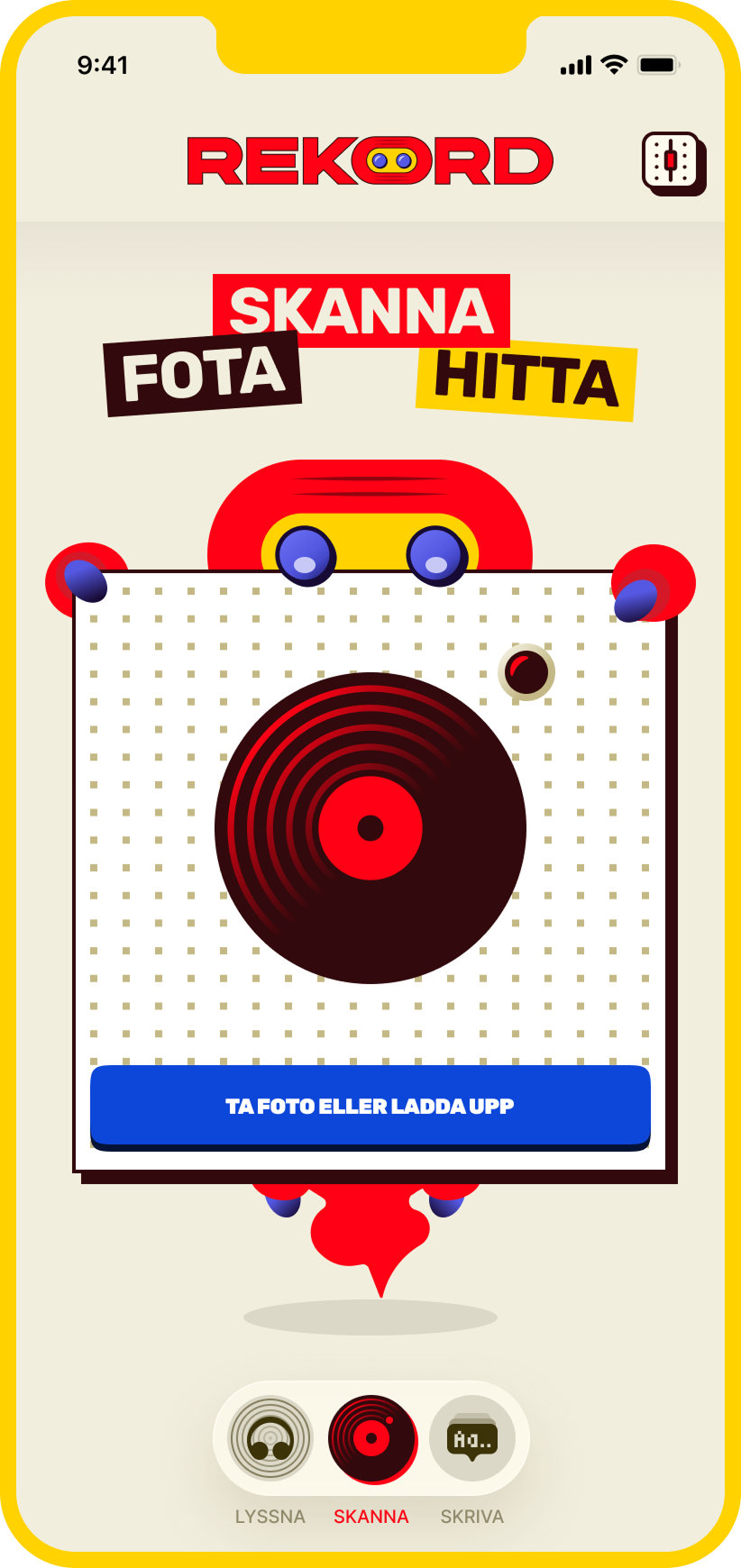
REKORD started as an experiment to see how far an idea could be taken using AI as part of the actual product process. A week in, v1 was live.
Client
Personal project
Team
LH+P
Year
2026
Platform
Web · iOS · Android
Role
Product designer · AI product development
Status
Live
Responsibilities
Product strategy · UX/UI · Visual identity · Design system · AI workflow · Testing
The problem wasn’t finding records. It was everything in between
Google it → check Discogs → listen on a streaming service → ask a friend → save a photo for later
Finding a unfamiliar record usually meant jumping between several places:
What is this? Is it any good? Is it worth the price?
Each step was easy. Together, they made a simple question unnecessary slow:
One action instead of five
Take a photo → identify → check the value
That became the starting point for REKORD.
For v1, I deliberately left the interface undesigned and let AI interpret the concept, with only a loose “Bauhaus meets pop-art” direction.
It produced a working product quickly
It also exposed how far “working” can be from “well designed”.
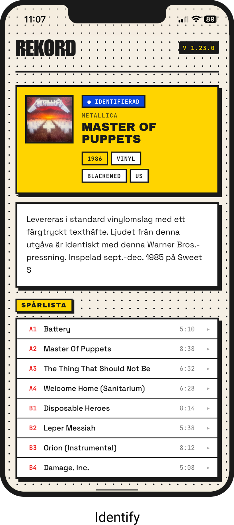
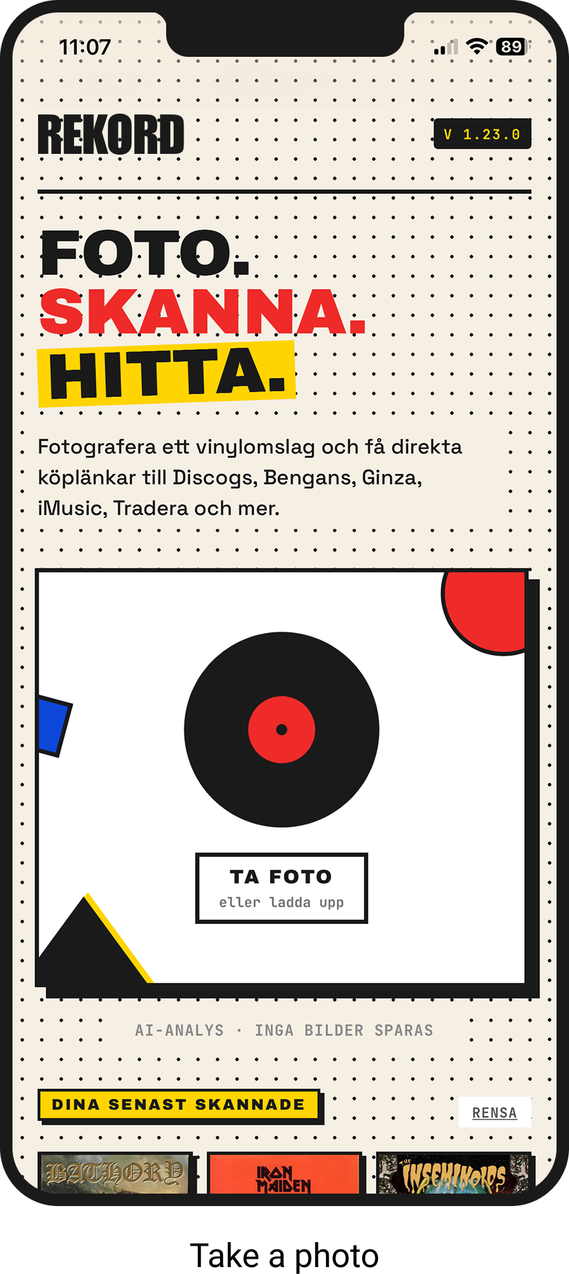
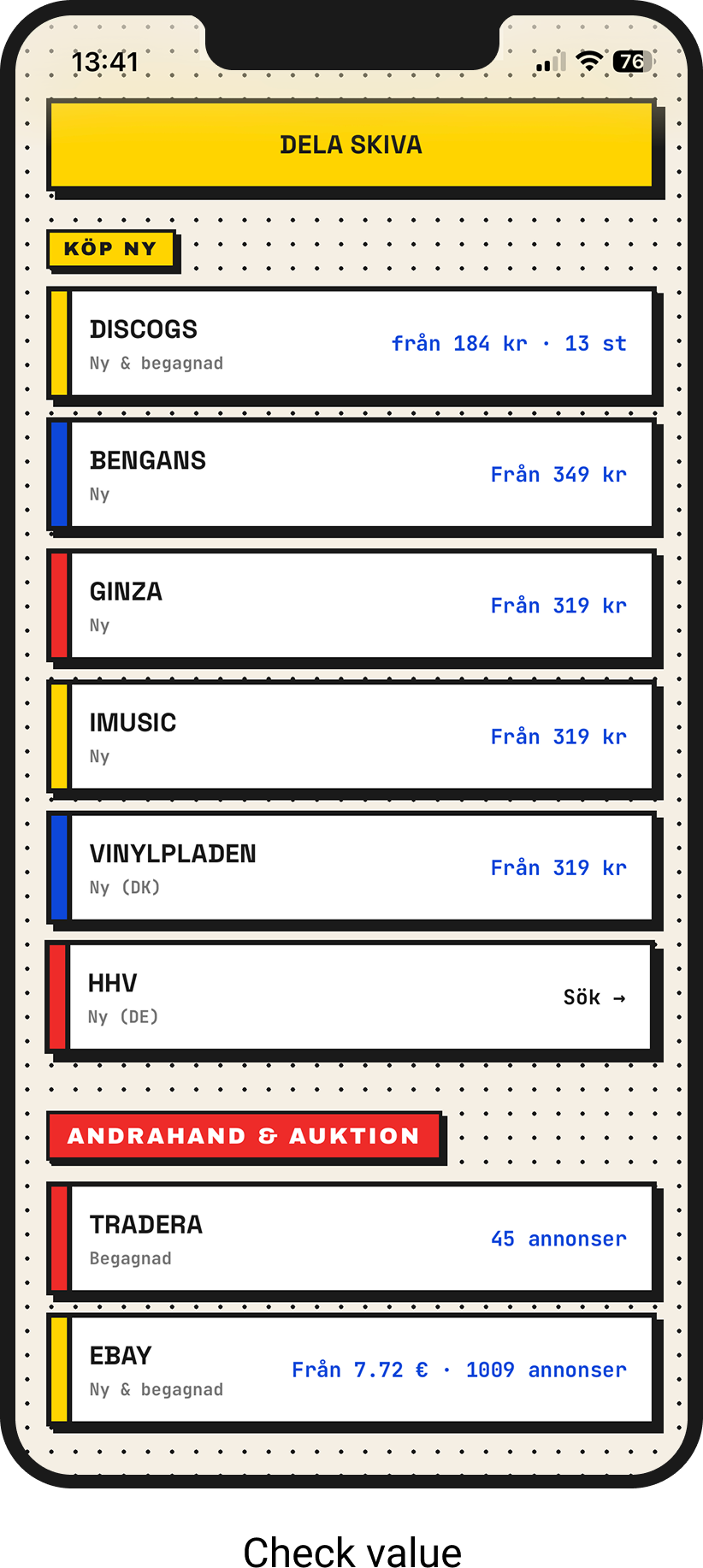
The prototype worked. The experience didn’t
V1 proved the idea could work. Using it also made the problems obvious.
AI could identify records but confidence was difficult to tune
Too strict and good scans returned nothing. Too forgiving and and it confidently suggested records that were clearly wrong.
The interface worked, but didn’t behave like an app
Scanning and history competed for attention. Navigation was awkward, failure states gave little feedback, and denying camera access could make the app appear broken.
The UI had never really been designed as a system
Typography was too small, touch targets were weak, contrast was inconsistent and components changed between screens.
The v2 principle was simple:
One intention at a time.
Scan becomes about scanning
History moved out
Failures got recovery paths
Waiting got feedback
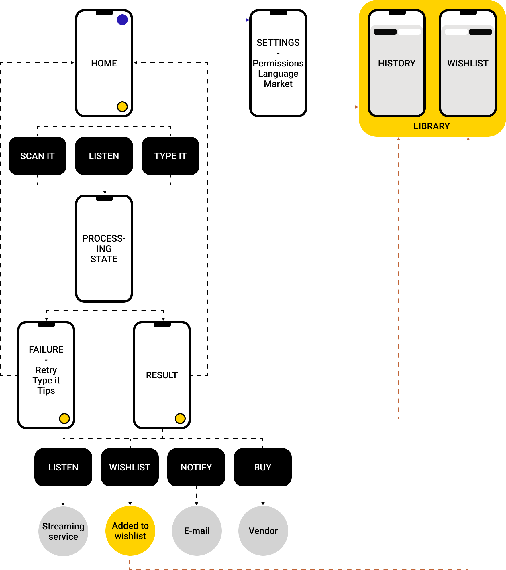
The v2 vision
From scanner to discovery tool
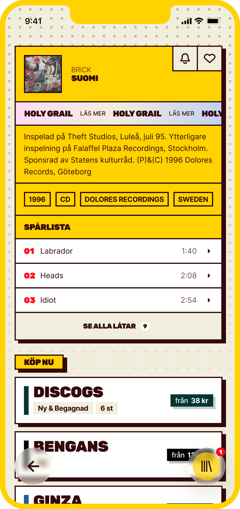
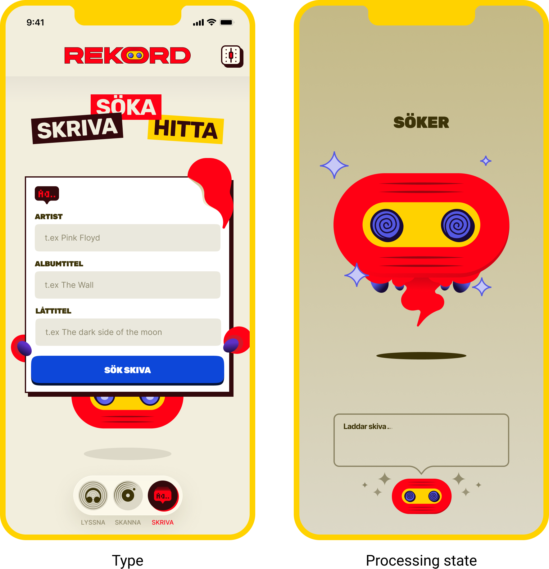
The first version solved one situation: “I have this record. What is it?”. But curiosity doesn’t always start with a record in your hand. Version two expanded further whether a record is worth attention. Three ways of discovering music:

Scan it
I have the record in fron of me.

Listen to it
I hear something and want to know what it is.

Type it
Somebody told me to look up a artist/album
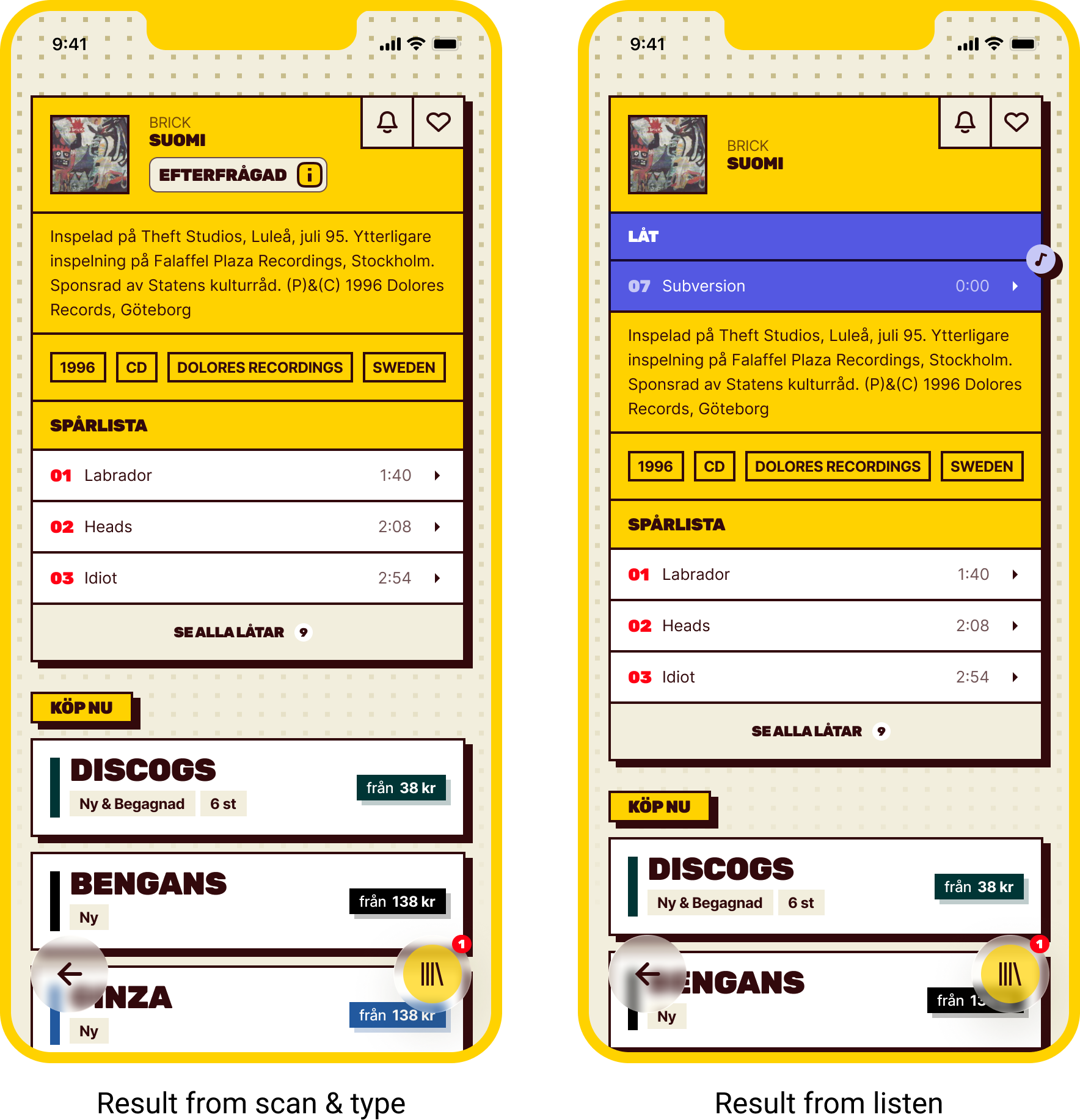
The result followed the record nerd’s questions
What is
this?
Artist + Album
Is it something special?
Rarity
Do I actually
like it?
Music + information
Is the price right?
Prices + marketplaces
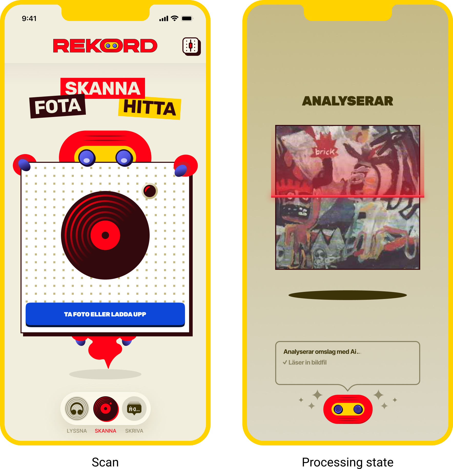
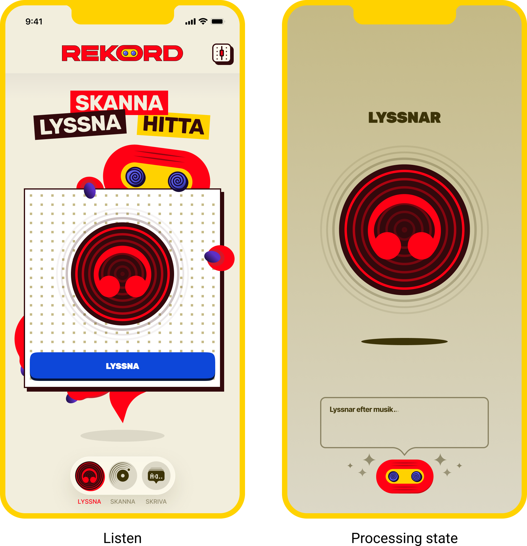
Giving REKORD character
V1 had a visual direction, but it didn’t really have an identity. For v2 I scrapped the AI-generated Bauhaus influence and started over. Taking some inspiration.
I wanted REKORD to feel boldly naive.
The reference wasn’t polished music-tech or another dark themed record collector app. I looked instead at pop art and the 80s and 90s magazines i grew up with. Expressive in colors, heavy shapes and graphics that aren’t afraid to take space.
And there is a reason for that.
Discovering music is emotional. I wanted REKORD to feel like the almost childish excitement of discovering something new.

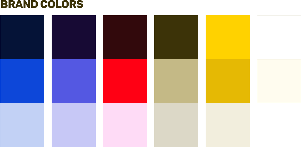

Rubik became the display type because its heavy forms give the interface weight, while the rounded shapes stop it feeling too serious. Inter does the opposite job. Deliberately quieter. Its job is readability.
The colors slightly clash rather than being restrained. The interface could be loud, as long as the underlying hierarchy stayed clear.
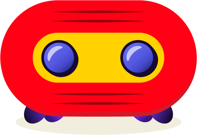
Then came Tassie
Tassie started as a compressed vinyl record turned into a face: Huge eyes curious and eager expression, slighly naive in the right way. Tassie wasn’t only branding. The character appears while REKORD scans, listens and searches. Turning otherwise invisible system activity into something the user can see and react to.
Explore first . Systemise later
I intentionally didn’t build the design system immediately. I designed enough of the product to understand its visual language first. Once the patterns started repeating, I turned them into components and rebuild v2 around a consistent system. That gave AI a system to work within.
Figma access didn’t remove handoff. It changed it.
Claude had access to the Figma file through MCP, so my first assumption was that the implementation would be straightforward. It wasn’t. Large tasks made Claude interpret too much and invent things that weren’t in the design. AI needed boundaries. So I changed my workflow:
Start small → implement → review → correct → expand the scope
I stopped asking Claude to build whole screens at once. First component, then a section, then a screen, then the flow.
The work started to feel less like prompting and more like directing a development handoff: define the task, review the result, correct it, then move on.
I wanted to know if we could ship it. We could.
6000+
Records in the database
3
Platforms: Web · iOS · Android
Featured on Product Hunt
Built for buyers. Usefull for sellers.
Record shops found another use we hadn’t originally designed for. Instead of manually searching Discogs record by record, REKORD could give them a faster starting point for identification and pricing.
AI made me faster.
Experience told me what was worth building.
The goal wasn’t to build the next Discogs. I wanted to understand what happens when AI becomes part of actually making a product. And it did make the process dramatically faster. But it also made one thing very clear:
AI is very good at getting an idea off the ground. It doesn’t know whether what it creates is actually good.
Knowing when a flow was wrong, when hierarchy failed, when accessibility was missing, or when something technically worked but simply felt bad still required judgement.