Bilia - connecting teams and customer journeys
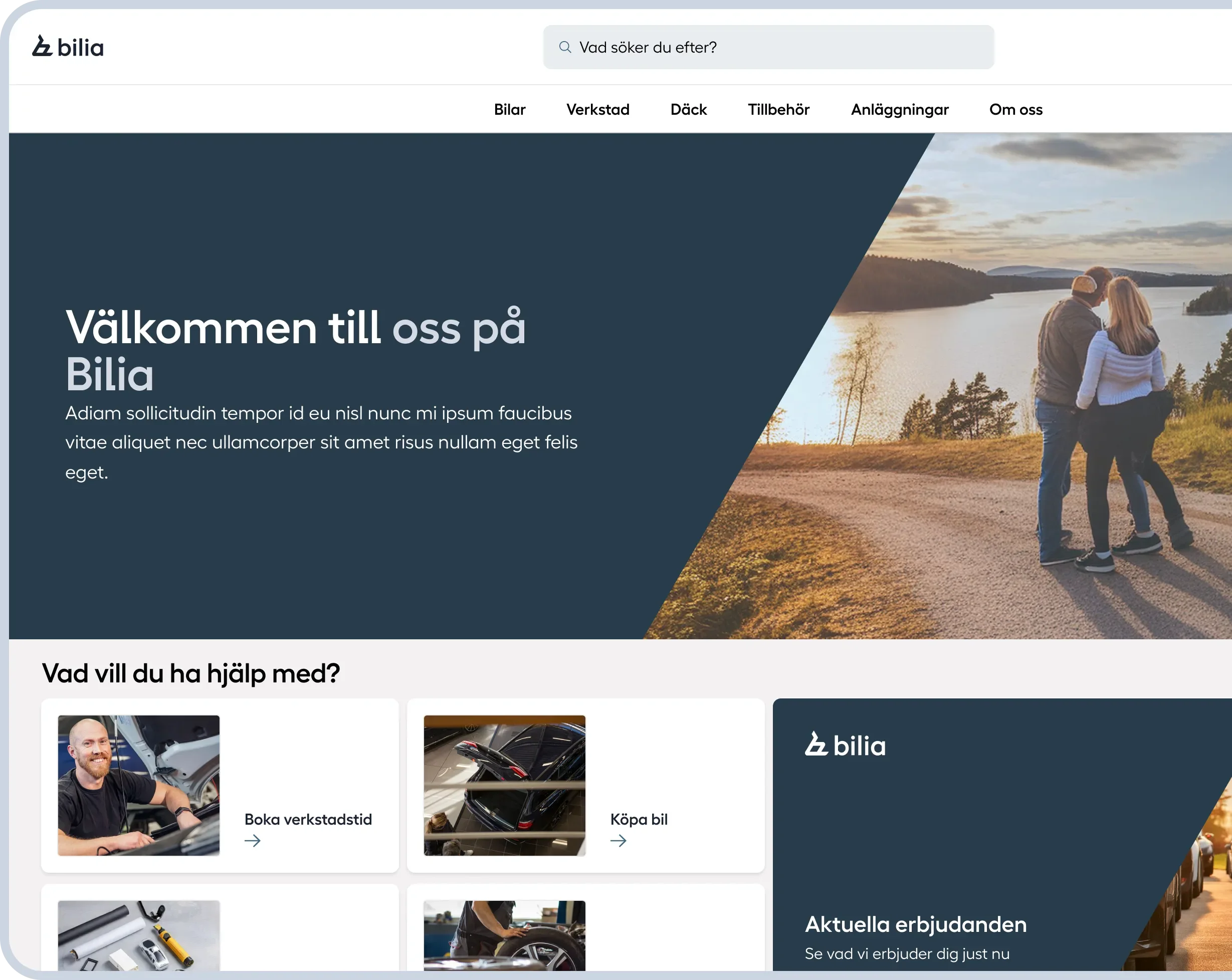
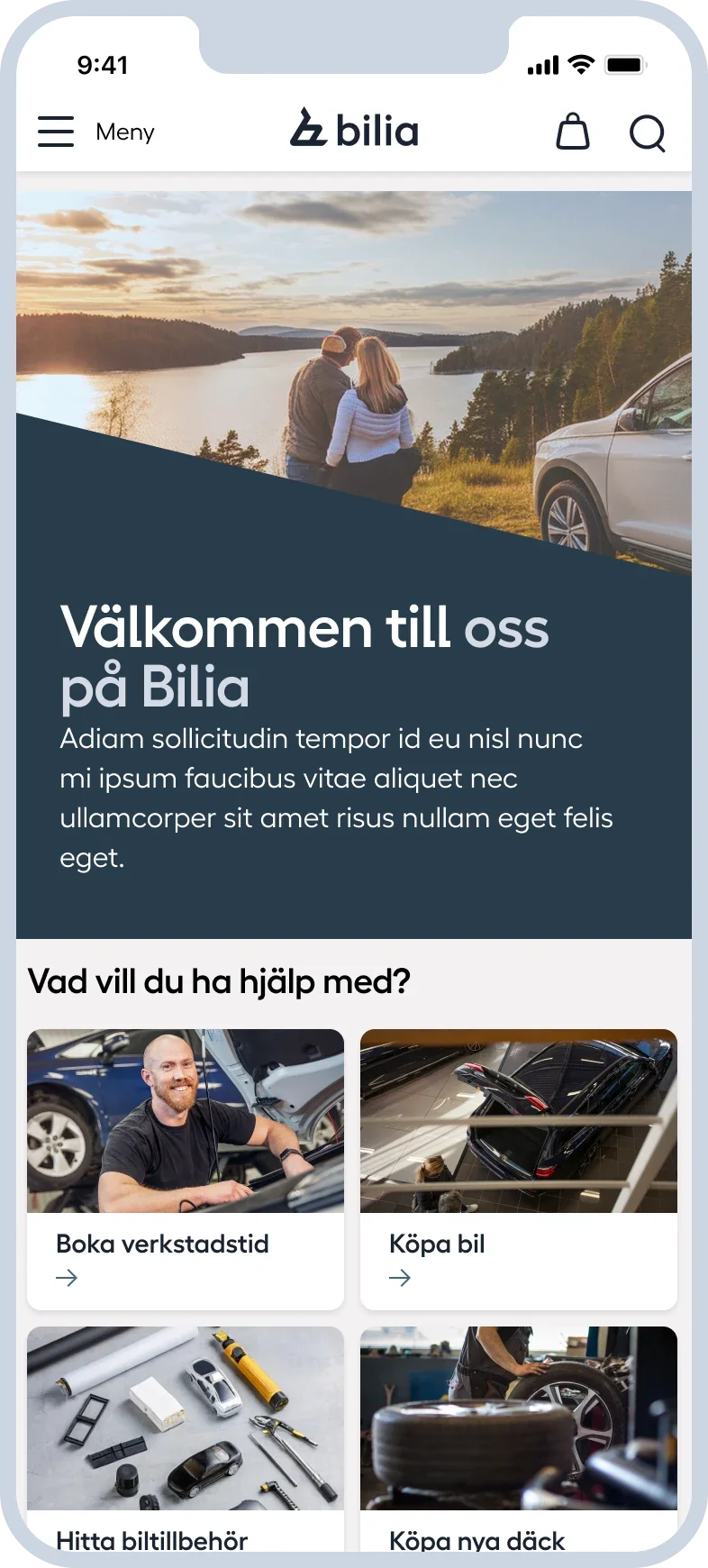
Over roughly a year as sole Product designer, I created its first design system, redesigned navigation and search, and connected purchasing with service booking. The work brought marketing and development together around a shared direction for the website.
Client
Bilia/Motorit
Team
Bilia marketing · Motorit development
Year
2024-2025
Platform
Web
Role
Product designer
Status
Released in stages
Responsibilities
UX/UI · Design system · Accessibility · User testing · Developer collaboration
From product cards to an accessible design foundation
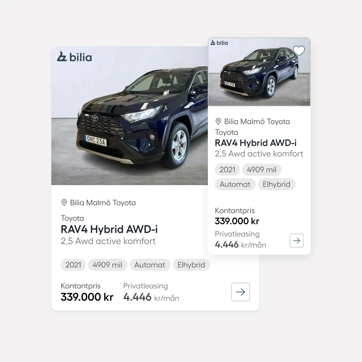
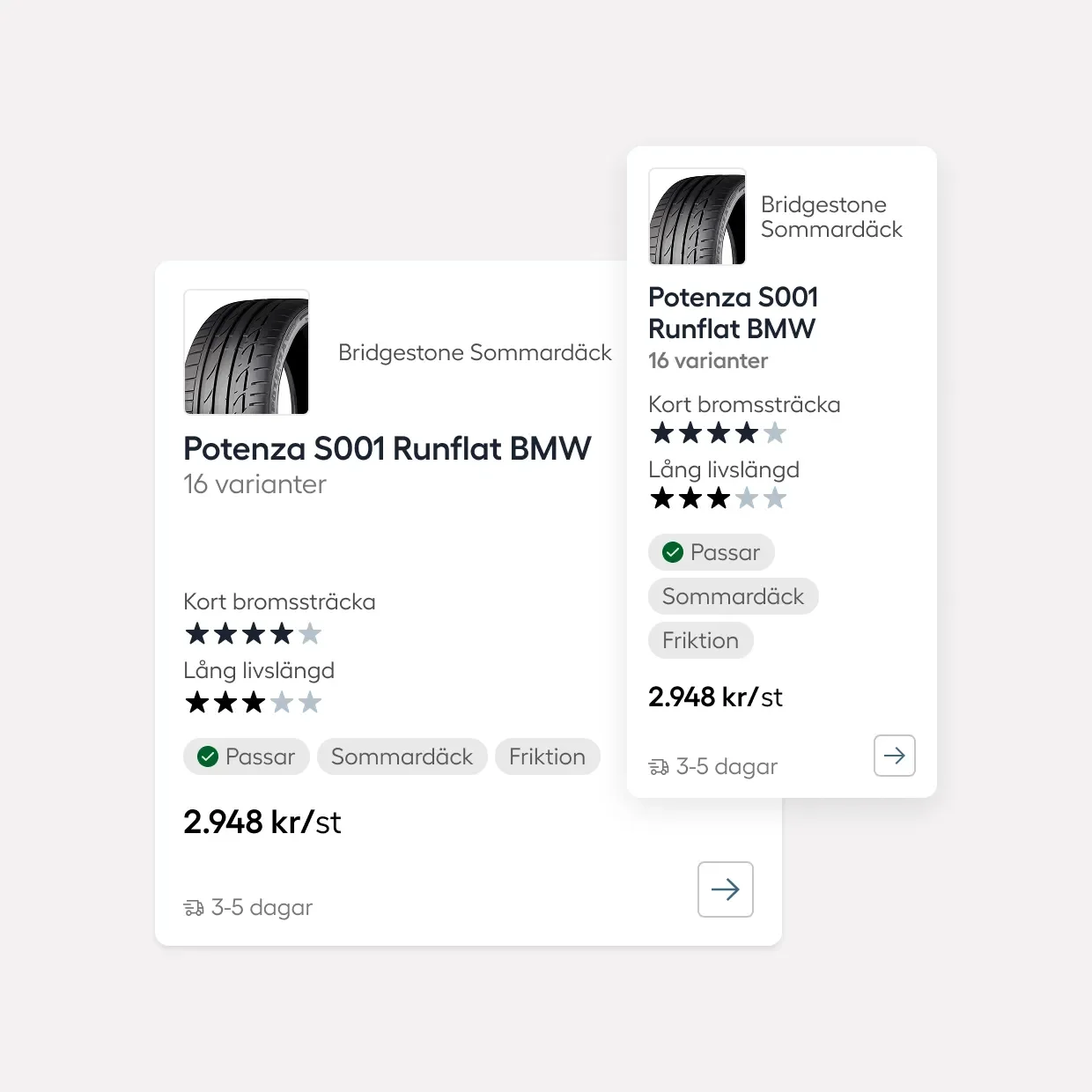
My work began with aligning Bilia’s products cards, as part of preparing the website for new accessibility requirements taking affect in June 2025.
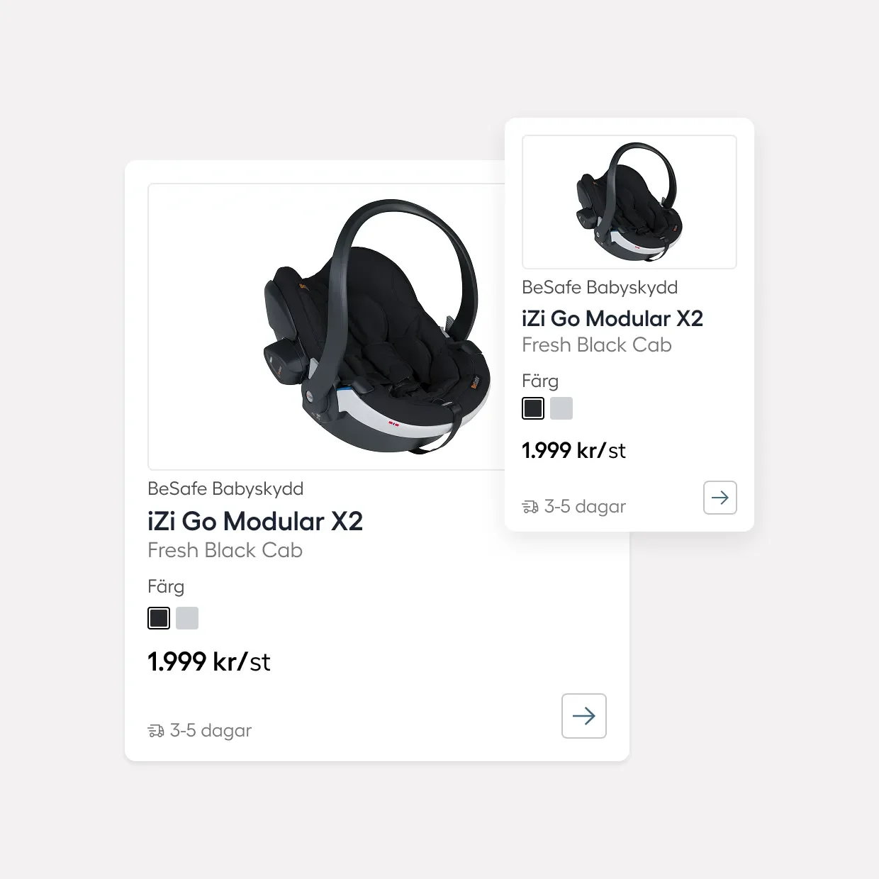
Inconsistencies extended across the webb
I saw early that the inconsistencies extended across the site. After redesigning the cards, I expanded the work into Bilia’s first ever design system. It contained shared rules and components to support accessibility and consistency across web and mobile.
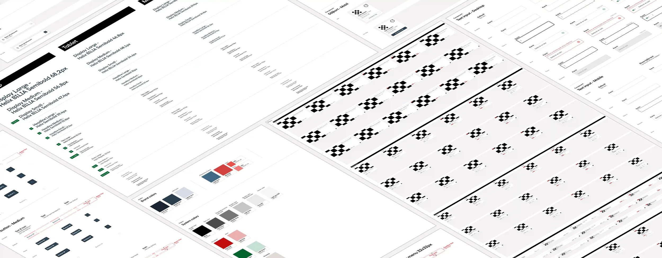
Making it work for both teams
Years of one-off requests had created inconsistencies and a backlog of fixes. Development responded with a stricter system, while marketing needed more flexibility. Both felt misunderstood.
Implementing weekly reviews
Through weekly reviews with each team, I shaped a system with clear rules and the flexibility marketing needed. I gathered feedback from marketing, revised the designs and worked through the reasoning and implementation with development. In the end, both teams helped shape the system and took pride in what we implemented.
The system in use
A page built from shared components.
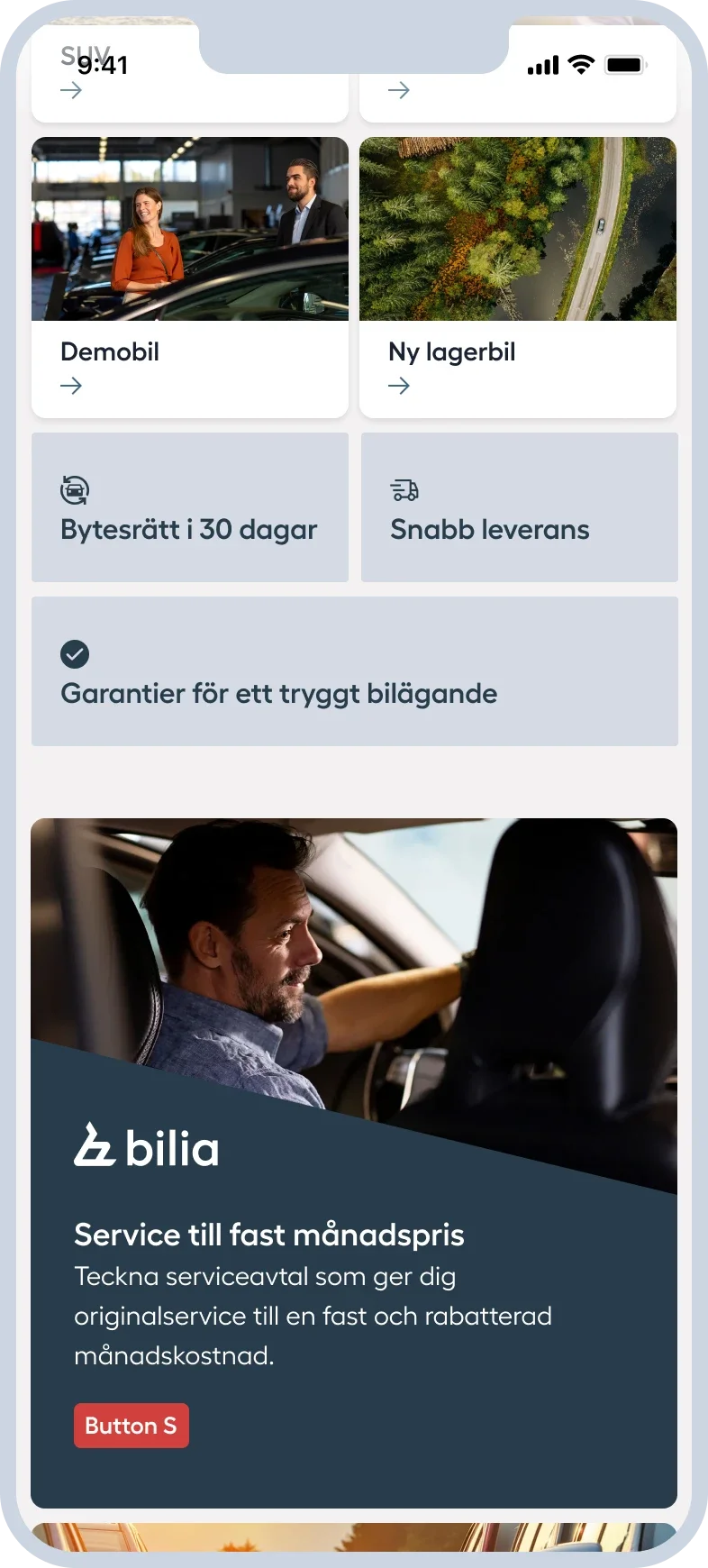
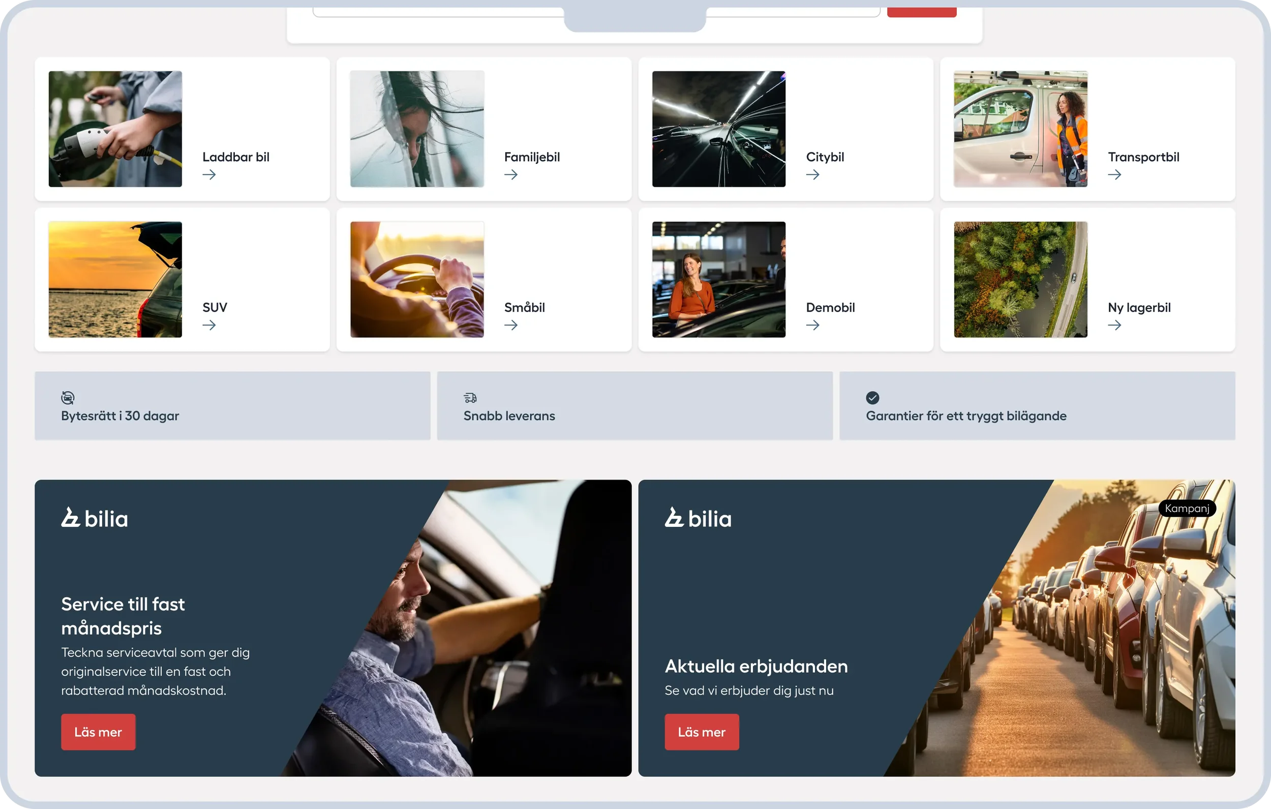
The components behind the page
Defined options gave marketing the flexibility with content and developers clear rules to build from.
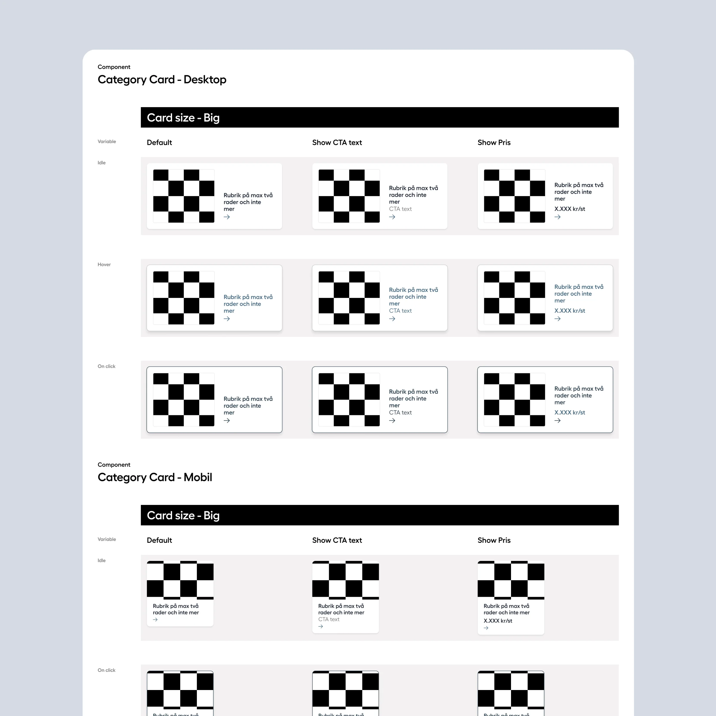
Category cards - guide customers to relevant categories, with variable options.
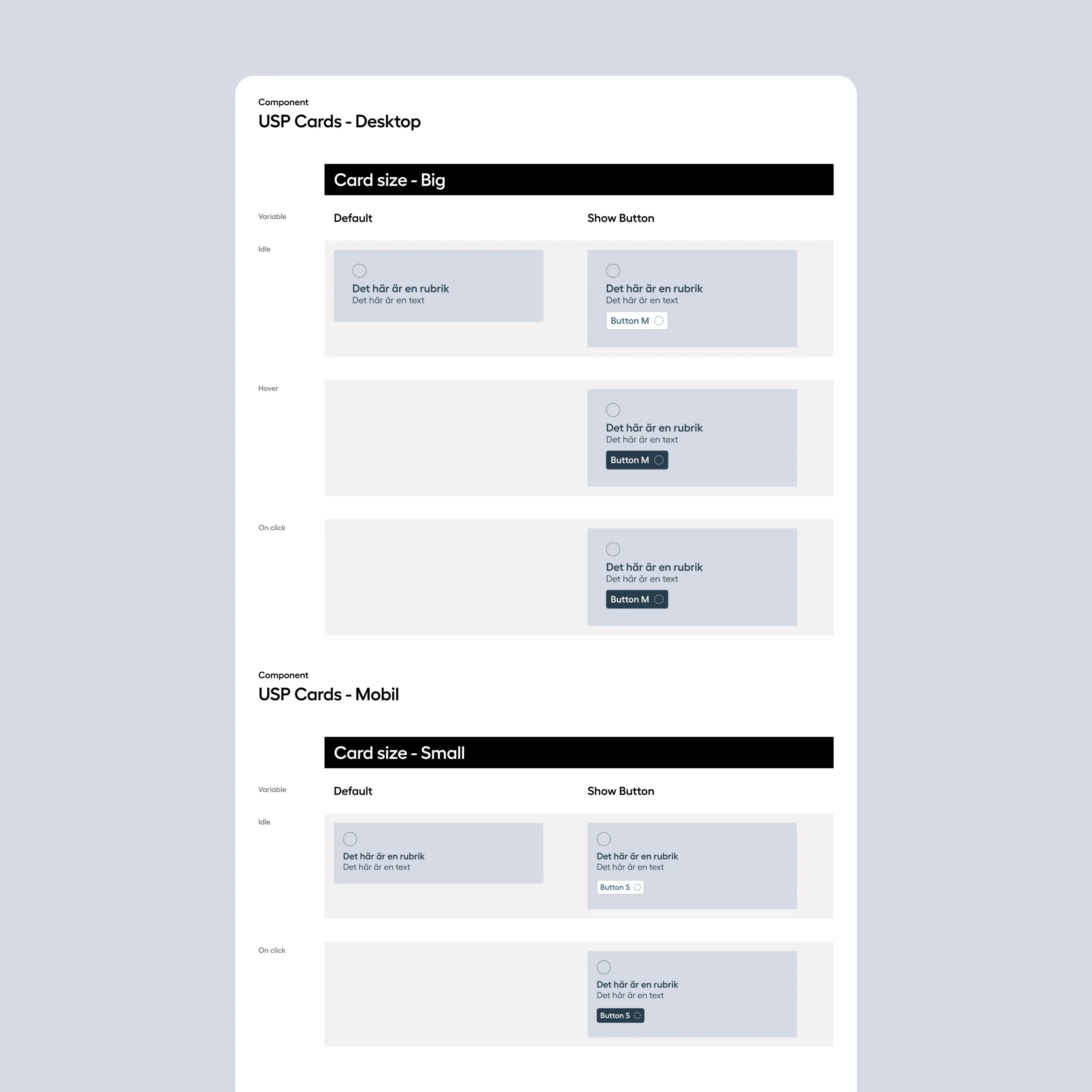
Benefit cards (USP Cards) - highlight benefits with optional CTA button
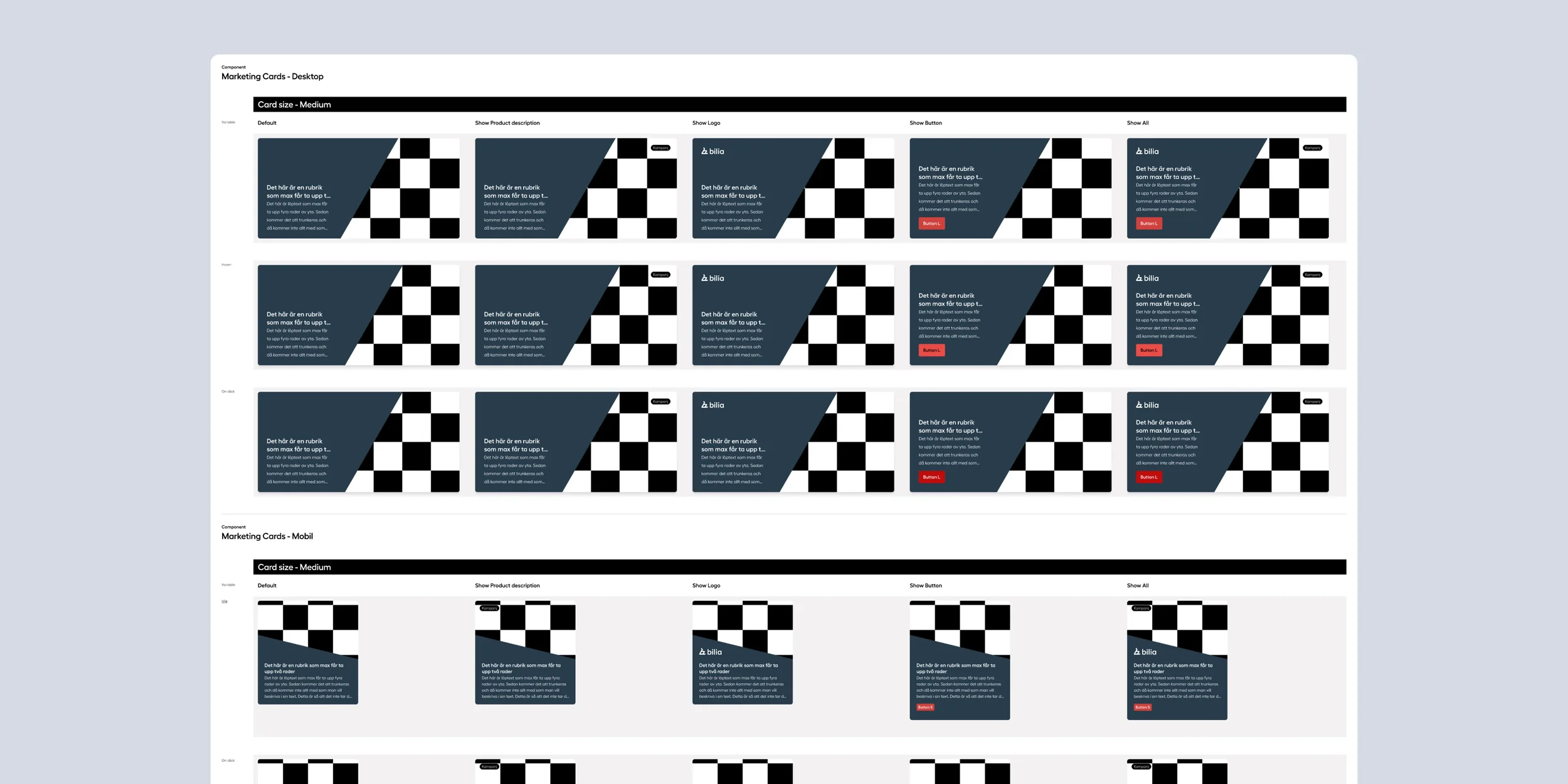
Marketing Cards - support different promotional content with optional logo, descriptions and buttons.
A simpler way to navigate
An earlier UX review had identified navigation problems. I used tasked-based testing on the existing website to understand how people found their way, then tested a proposed new navigation.
What we learned
The prototype menu was too complex. People often selected a category and continued exploring on the webpage.
What we changed
I simplified the menu levels, clarified the categories and moved more context onto the page.
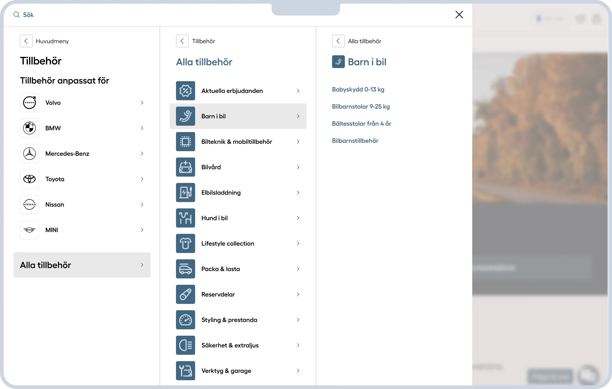
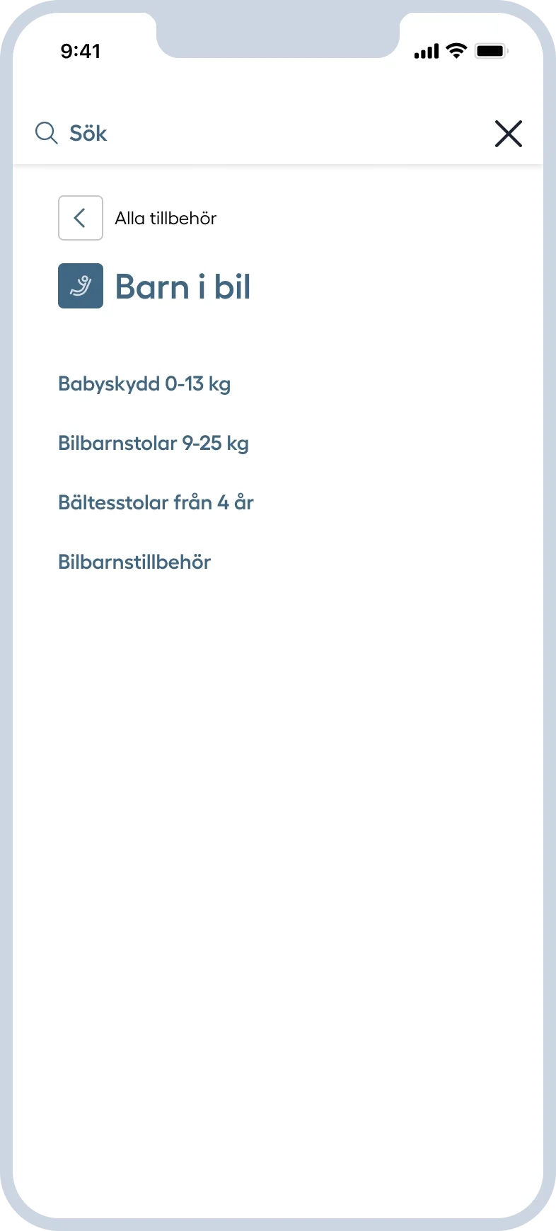
A maximum of 3 levels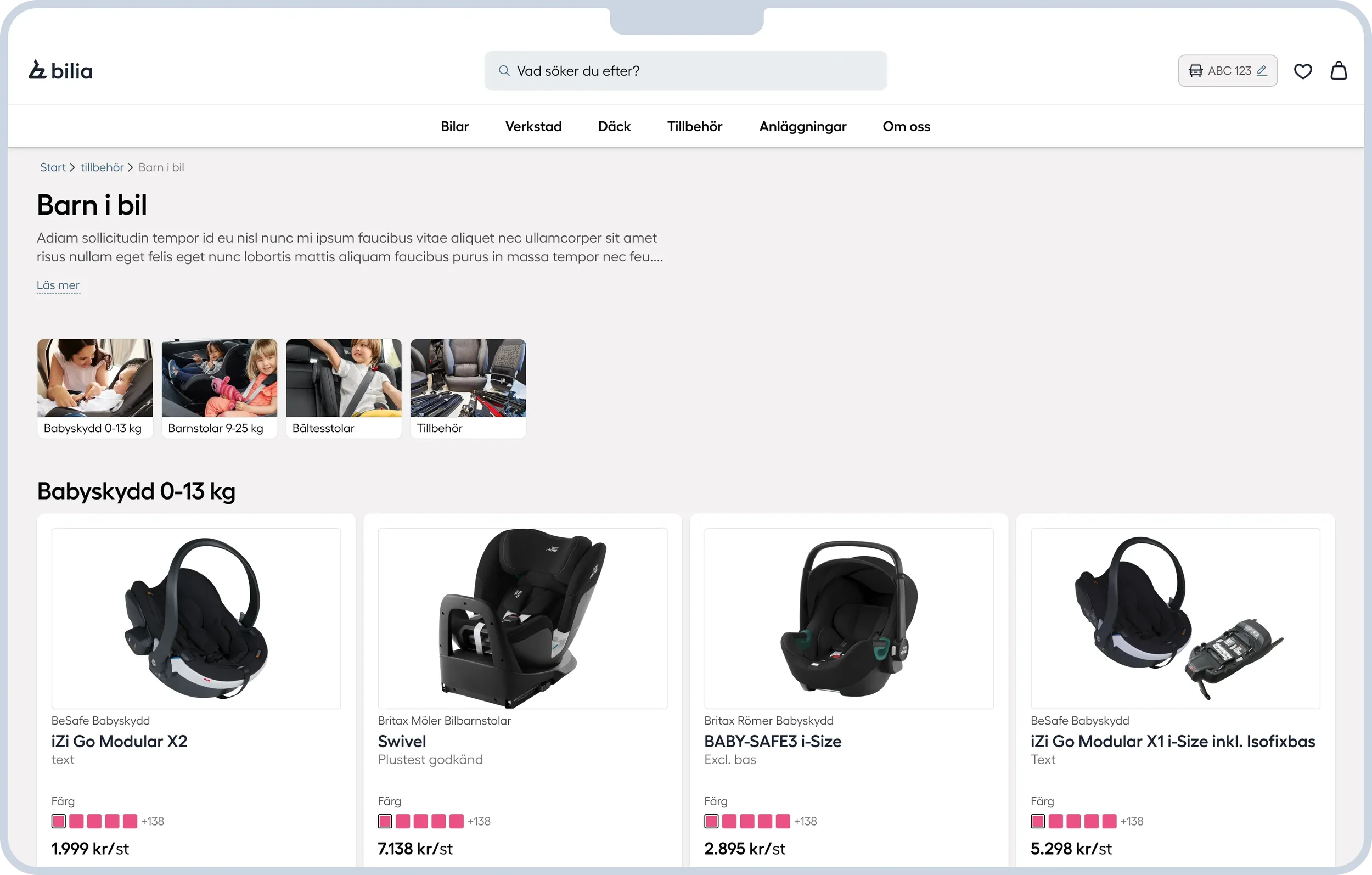
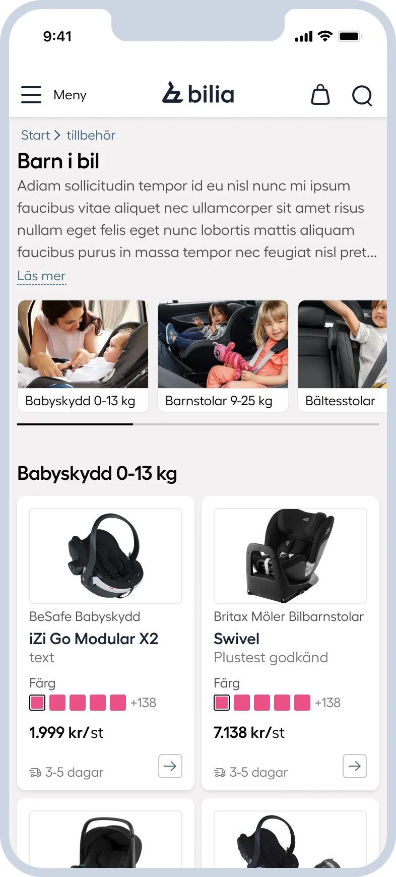
Continue navigation of the page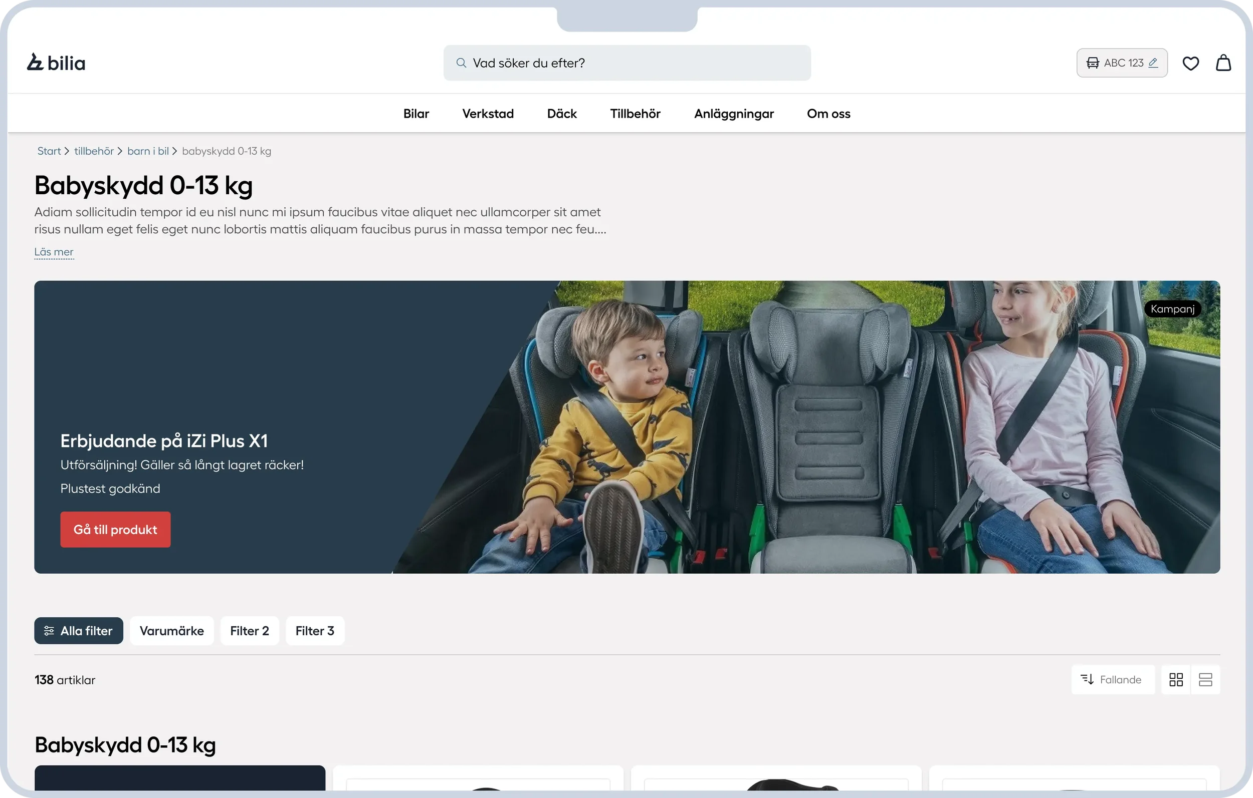
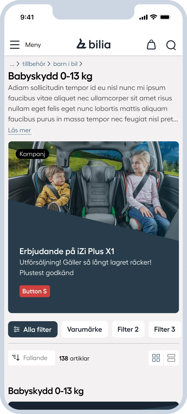
From navigation to filtering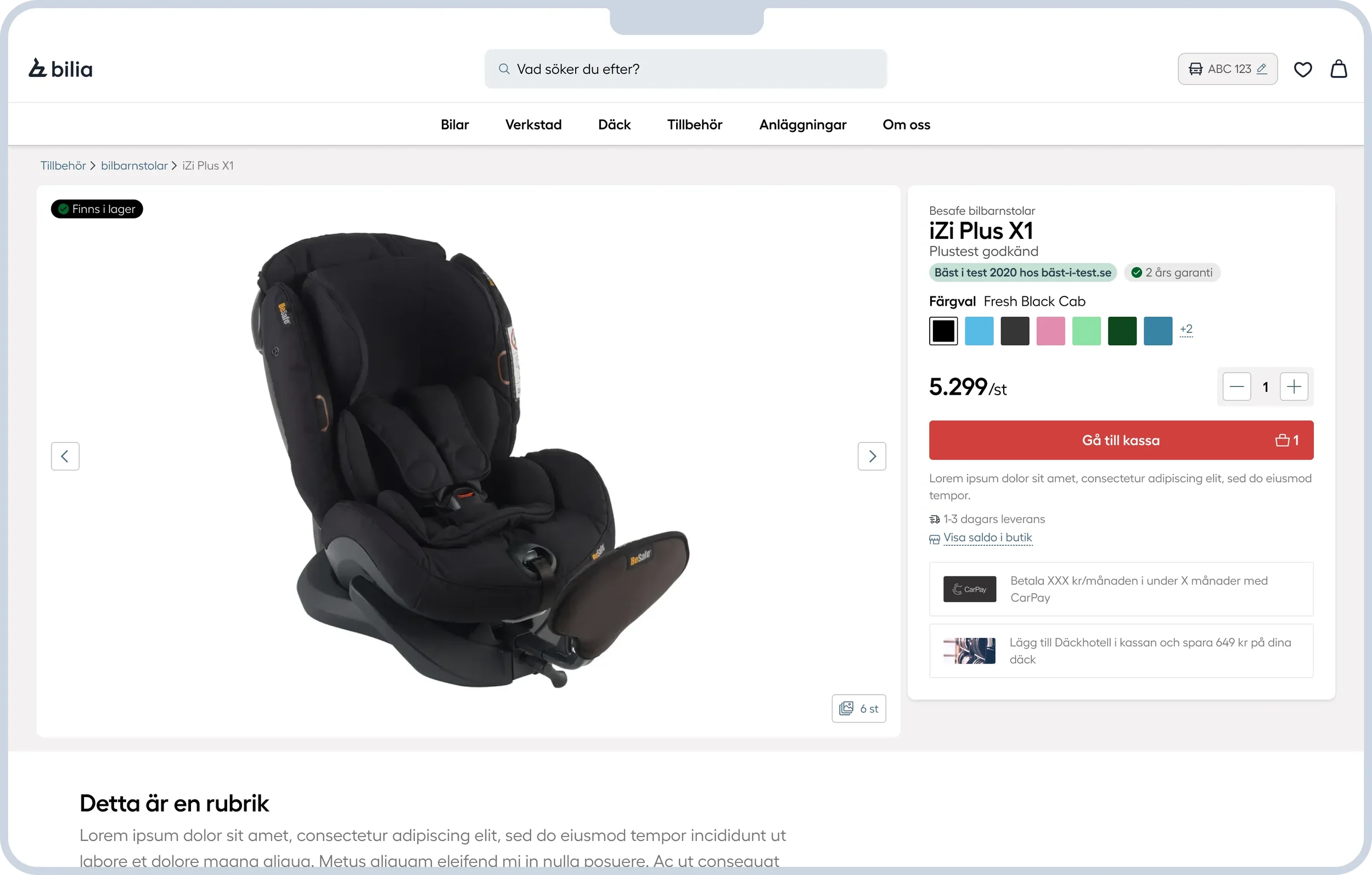
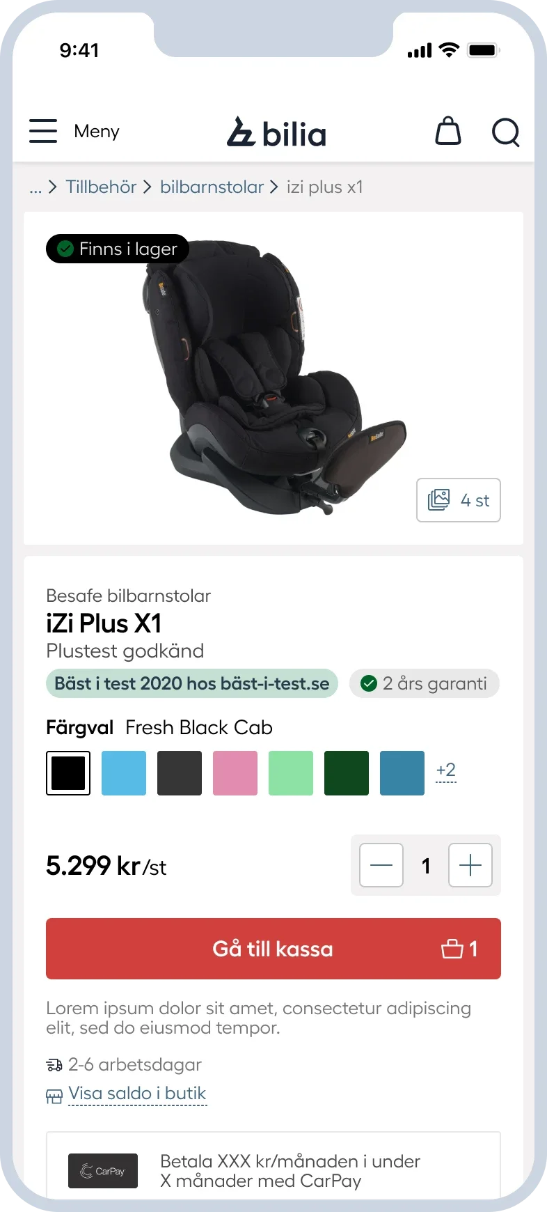
From finding to choosingFinding products across brand boundaries
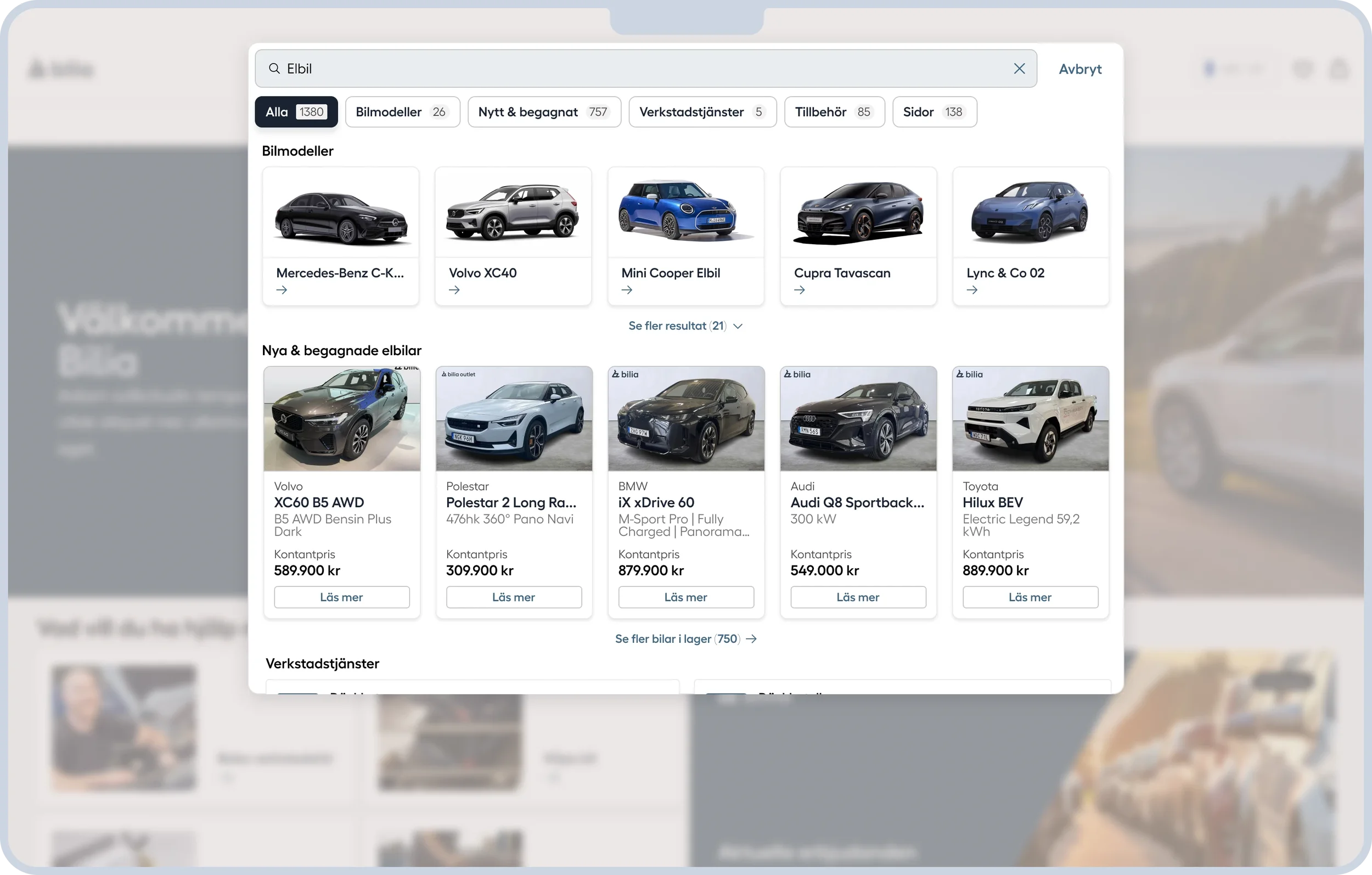
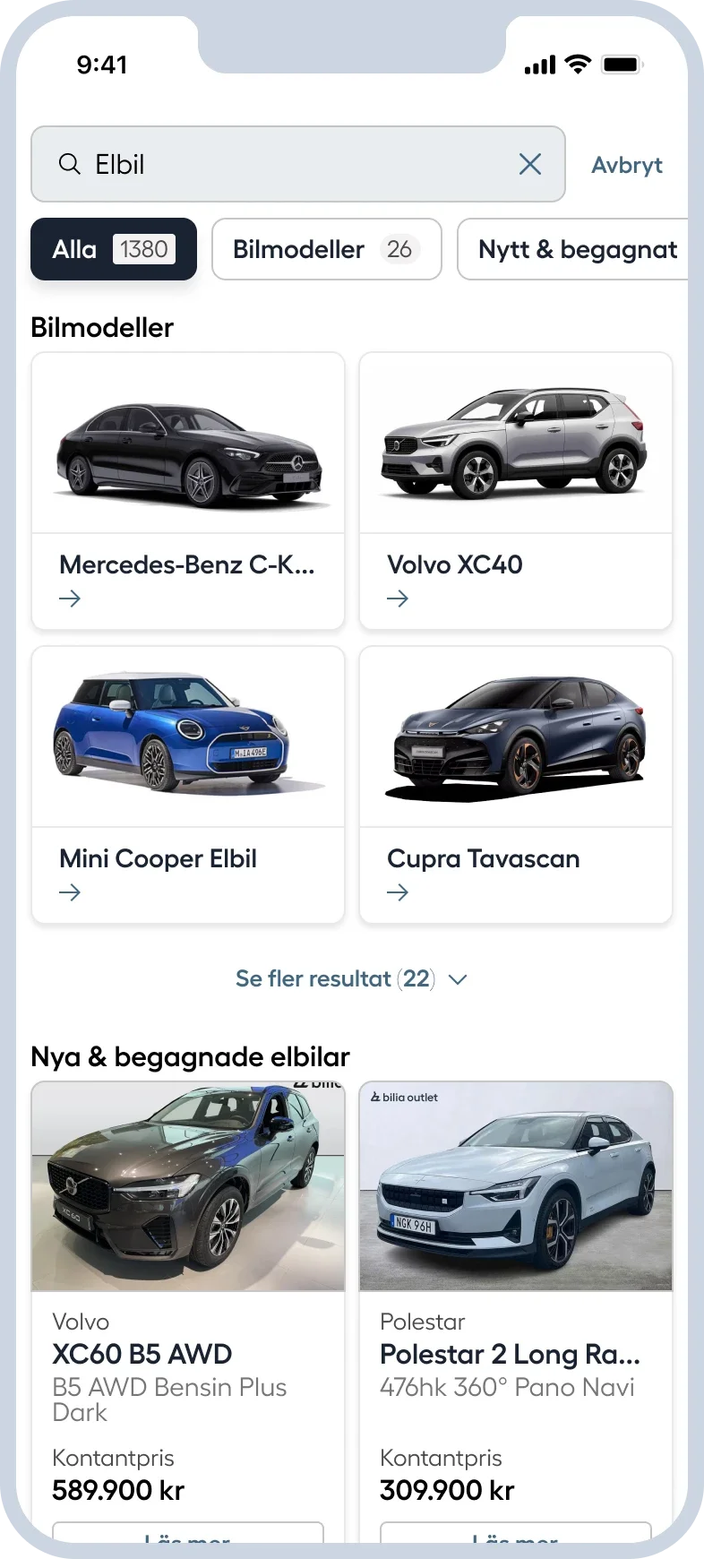
Brand requirements meant the menu needed separate paths for individual brands. But customers didn’t always start with a brand in mind. Global search was proposed as a way to address this. I designed how it worked and behaved, discussing the decisions with marketing and development throughout.
Start with what you need and narrow it down.
A search for electric car should show matching cars across brands. Filters within search helped customers find relevant results depending on its category.
Connecting buying and booking
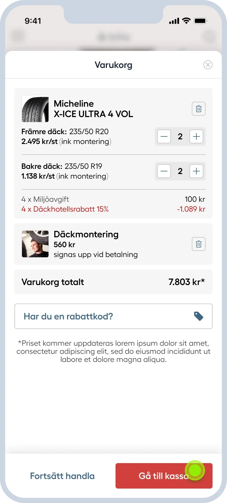
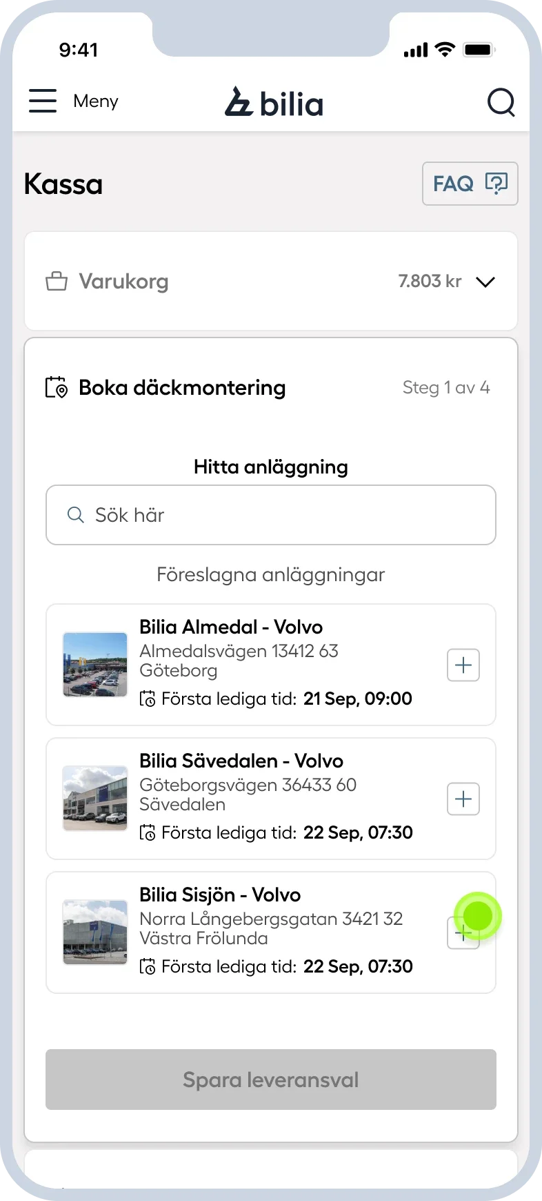
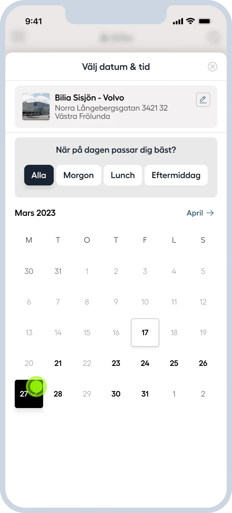
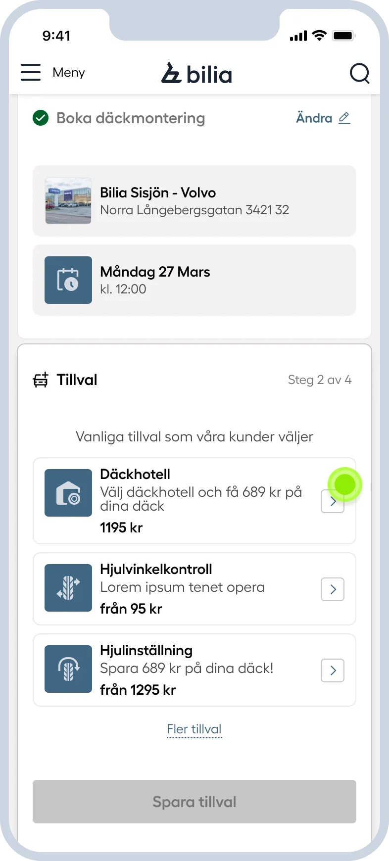
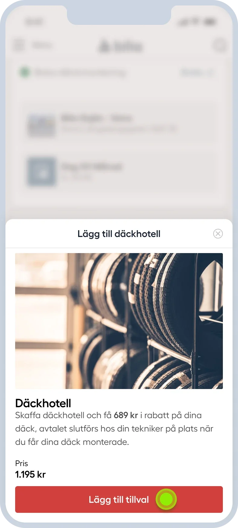
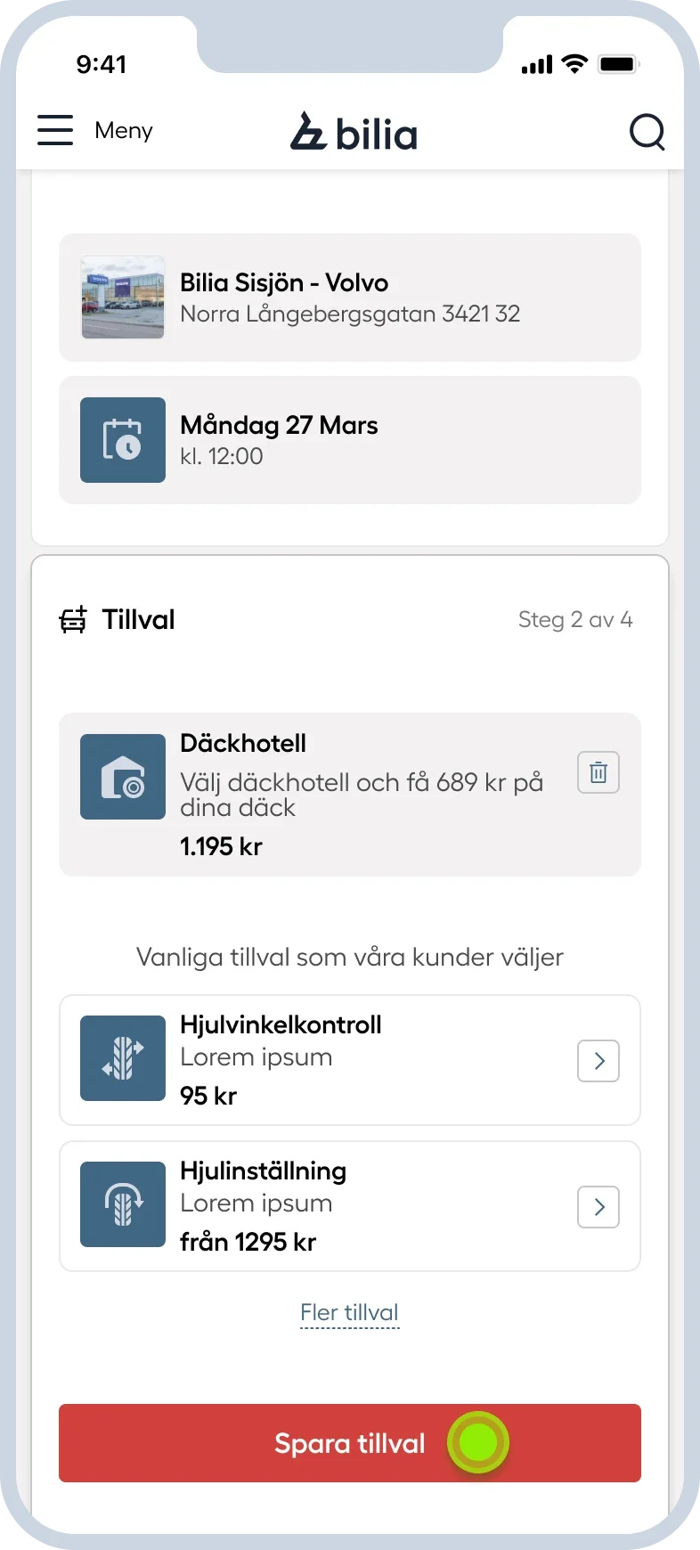
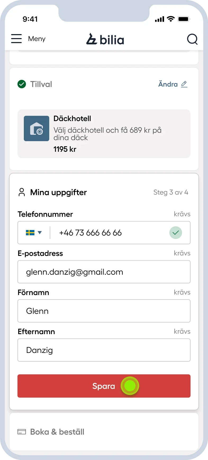
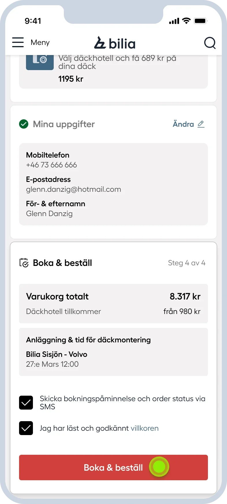
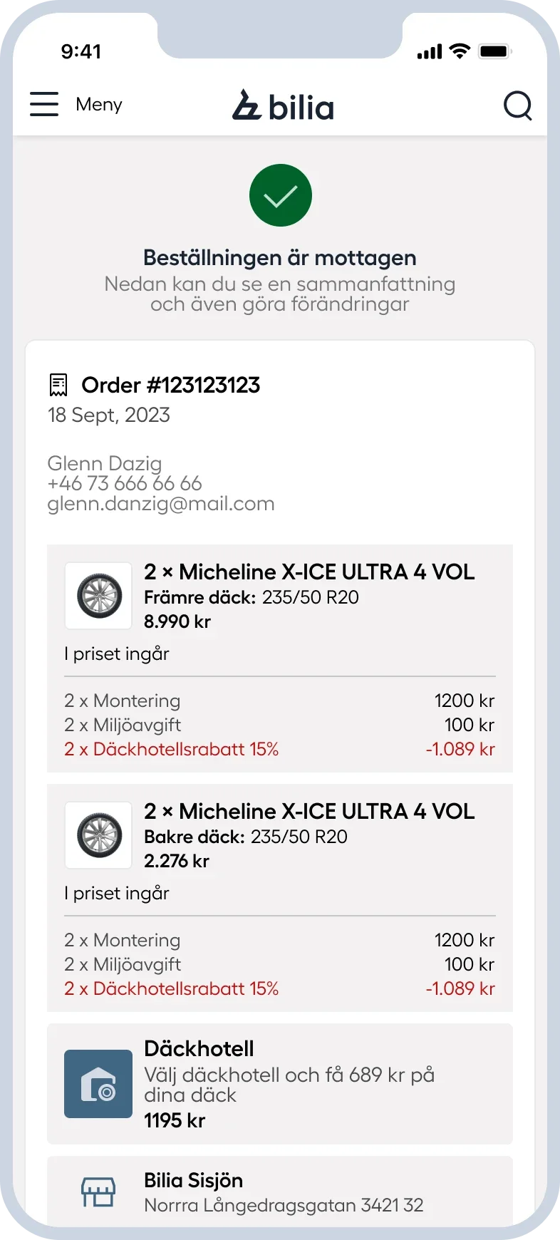
Bilia sells products and services that often belong together. Customers might buy tires and book fitting, for example, but purchasing and booking were handled as two separate flows. I designed a unified experience connecting these.
2
3
4
5
7
8
1
6
9
Outcome
A shared design foundation, completed before the accessibility deadline.
I completed the design work ahead of the June 2025 accessibility deadline. Always staying ahead of development by aligning with stakeholders early.
Still guiding new work.
The system remains a blueprint for design work across the website. The success of this is because marketing and development helped shape the system from day one.