Hemköp - Redesigning the core mobile shopping experience
Hemköp’s app relied heavily on migrated web views and behaved like another version of the website. I helped transform it into a purpose built mobile product.
Reported result:
Increased conversion and average order value. The project subsequently became an internal benchmark and reference for Hemköp’s future product work
Client
Hemköp
Platform
iOS & Android/React Native
Year
2023
Status
Released
Role
Product Designer
Responsibilities
UI Design · Design system · Workshop
Team
LH+P team & Hemköp product and development
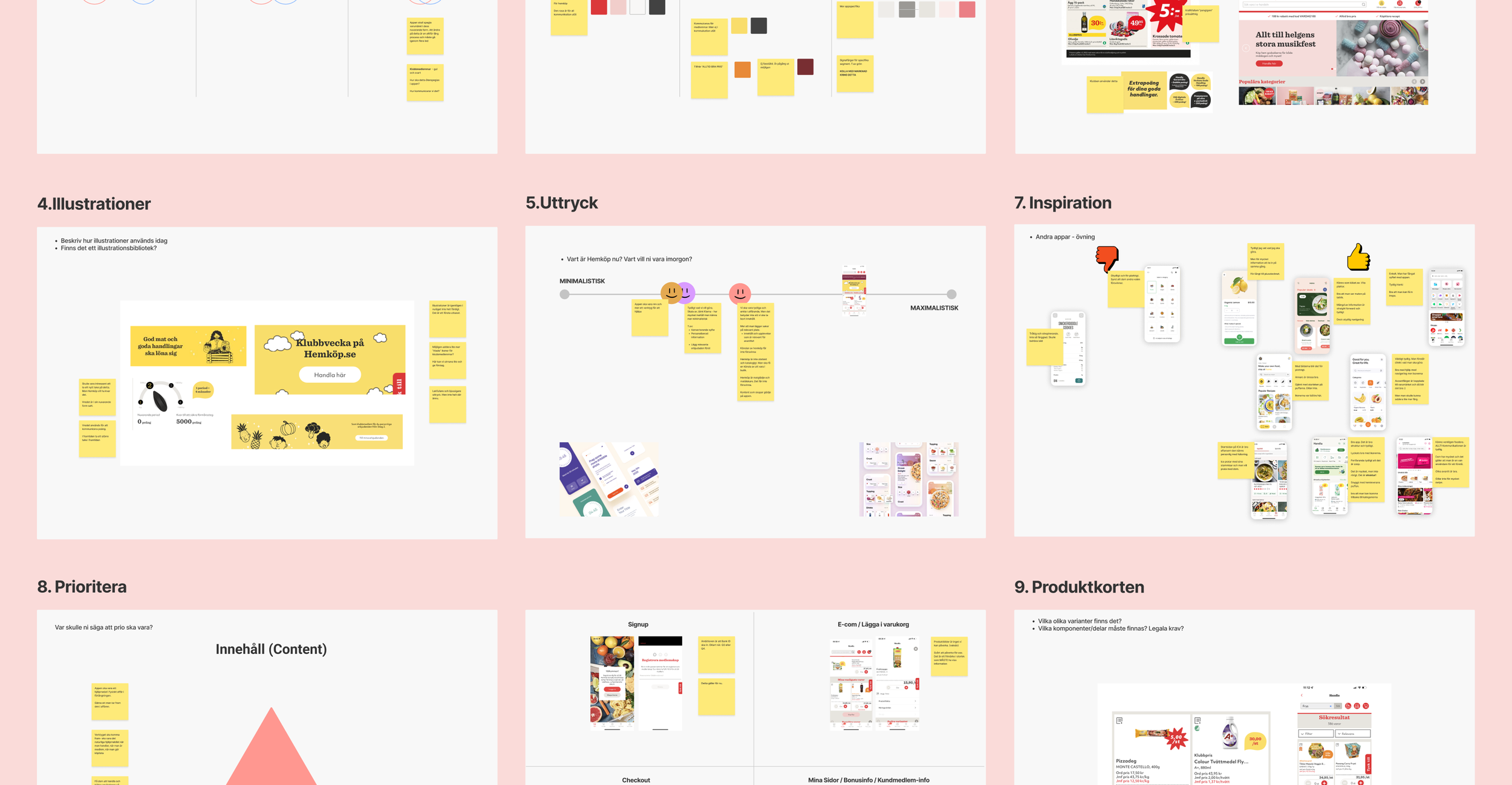
Hemköp asked for a updated app, but “redesigning the app” was not a sufficiently specific design brief. Before designing screens, I needed to establish what the new experience should achieve, which journeys mattered most and how closely the app should follow the existing brand.
1.
What should the app achieve?
2.
How should it express the Hemköp brand?
3.
Which parts of the experience matters the most?
4.
Where should the app sit between minimal utility and food inspiration?
Conclusion
Increase completion of purchases
Make the app useful at home, in-store and for members
Prioritise e-commerce flow and membership
Use a cleaner, more structured interface
Retain Hemköp’s warmth and appetite appeal
Separate general retail communication from member-specific communication
Use relevant content rather than simply reducing content
Working one decision at a time
Instead of presenting the complete redesign as a finished package, I divided the work into decisions that could be reviewed and resolved during weekly meetings. We began with the overall visual direction, then moved into product cards, member benefits, mobile shopping behaviour, checkout and component implementation.
Stakeholders could respond to one question at the time
Decisions were resolved before detailed work accumulated
Development constraints entered the process early
The design developed with client ownership rather than being unveiled at the end
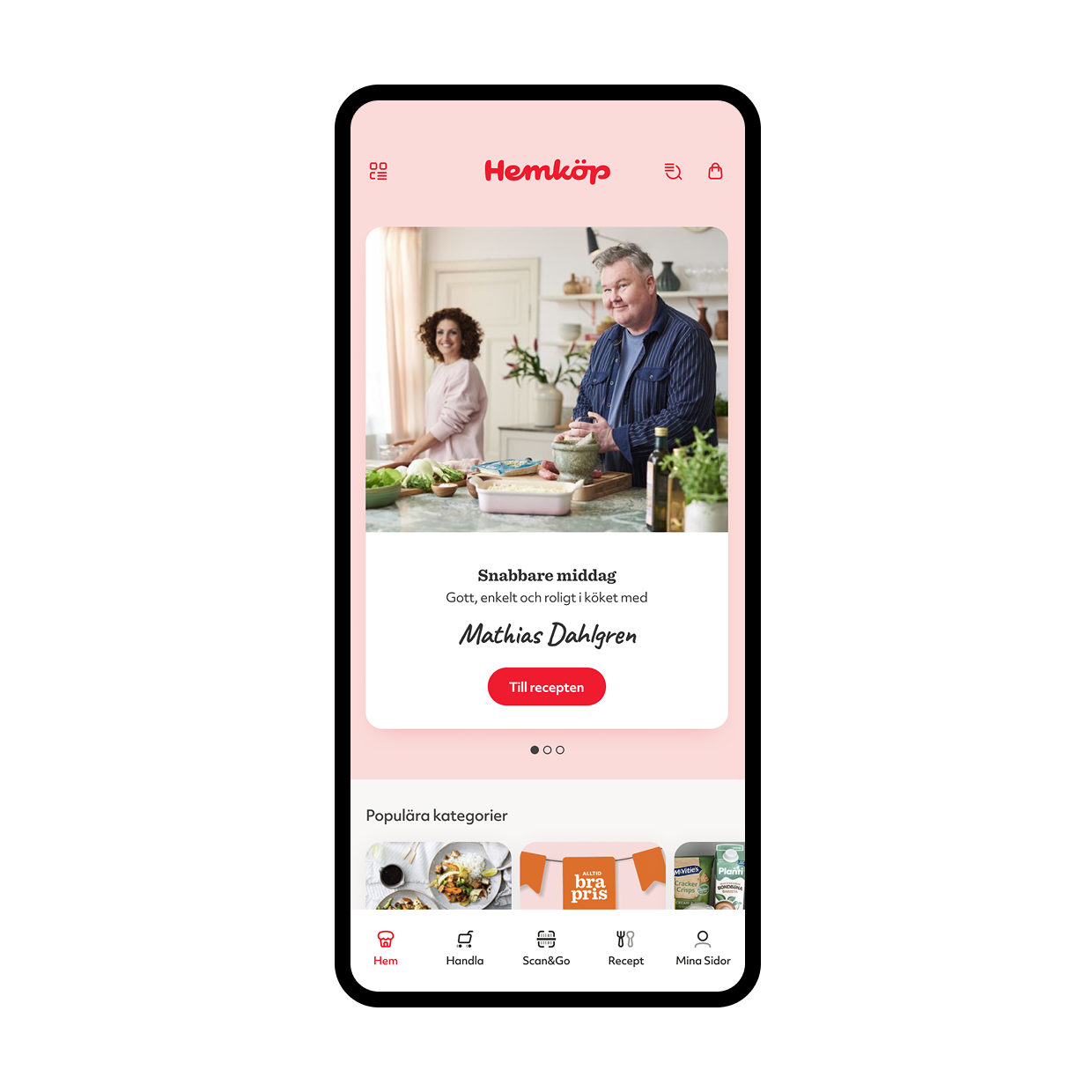
New Design philosophy
Clear and structured in interaction, expressive and appetising in content

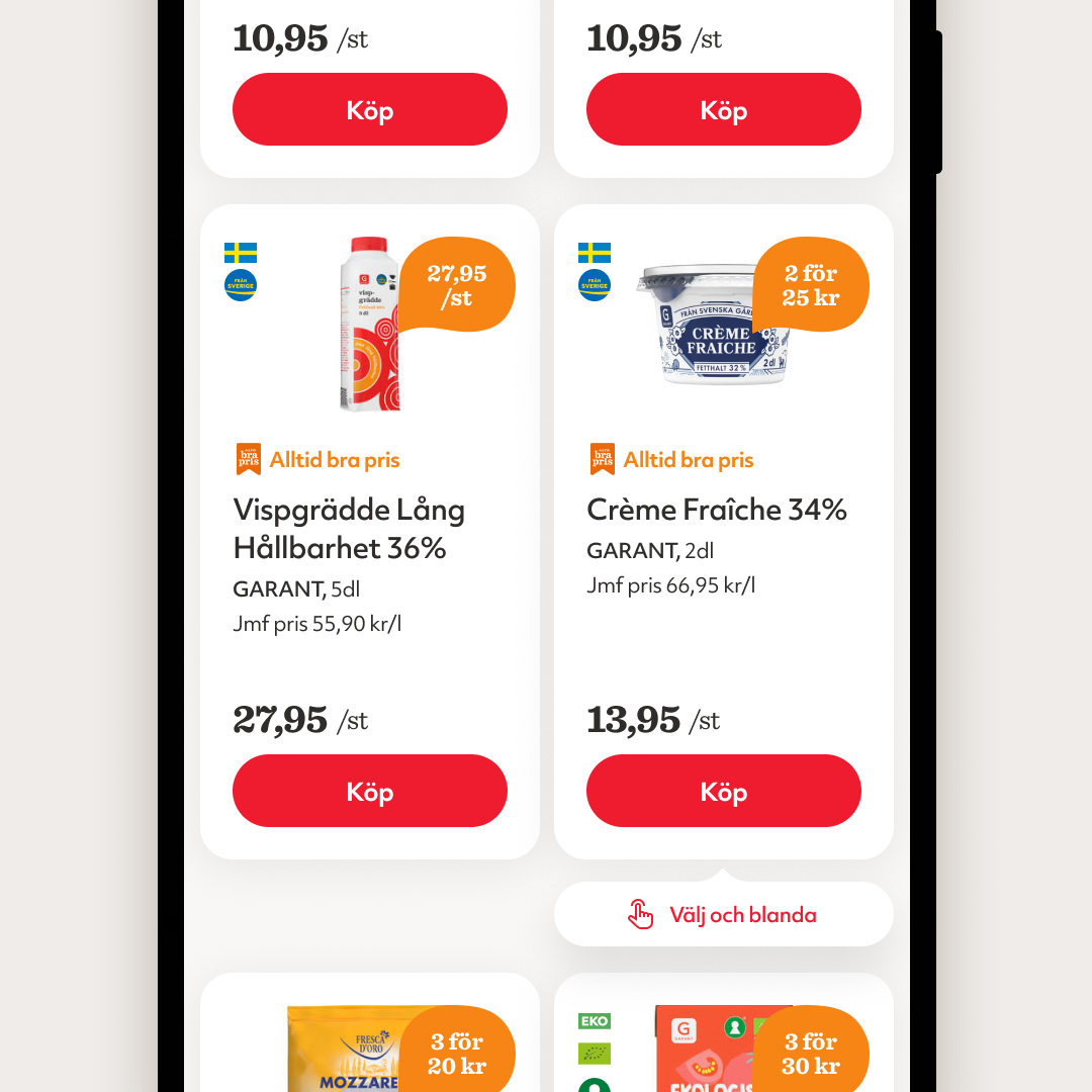
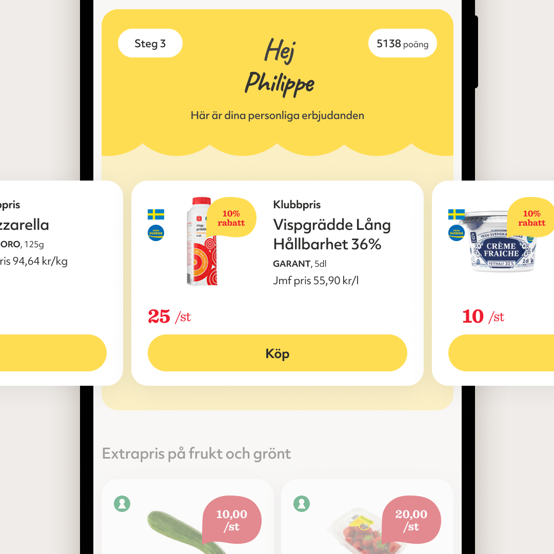
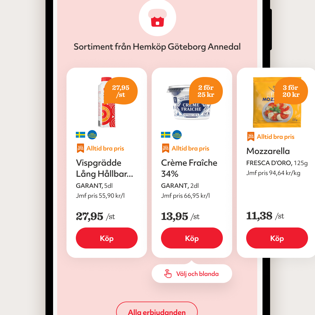
Product cards
Problem
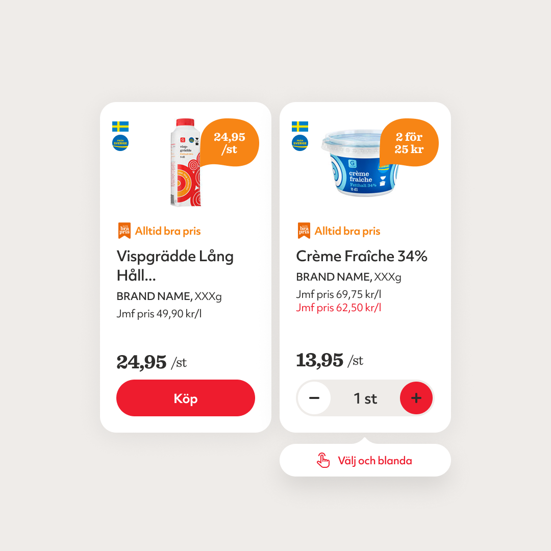
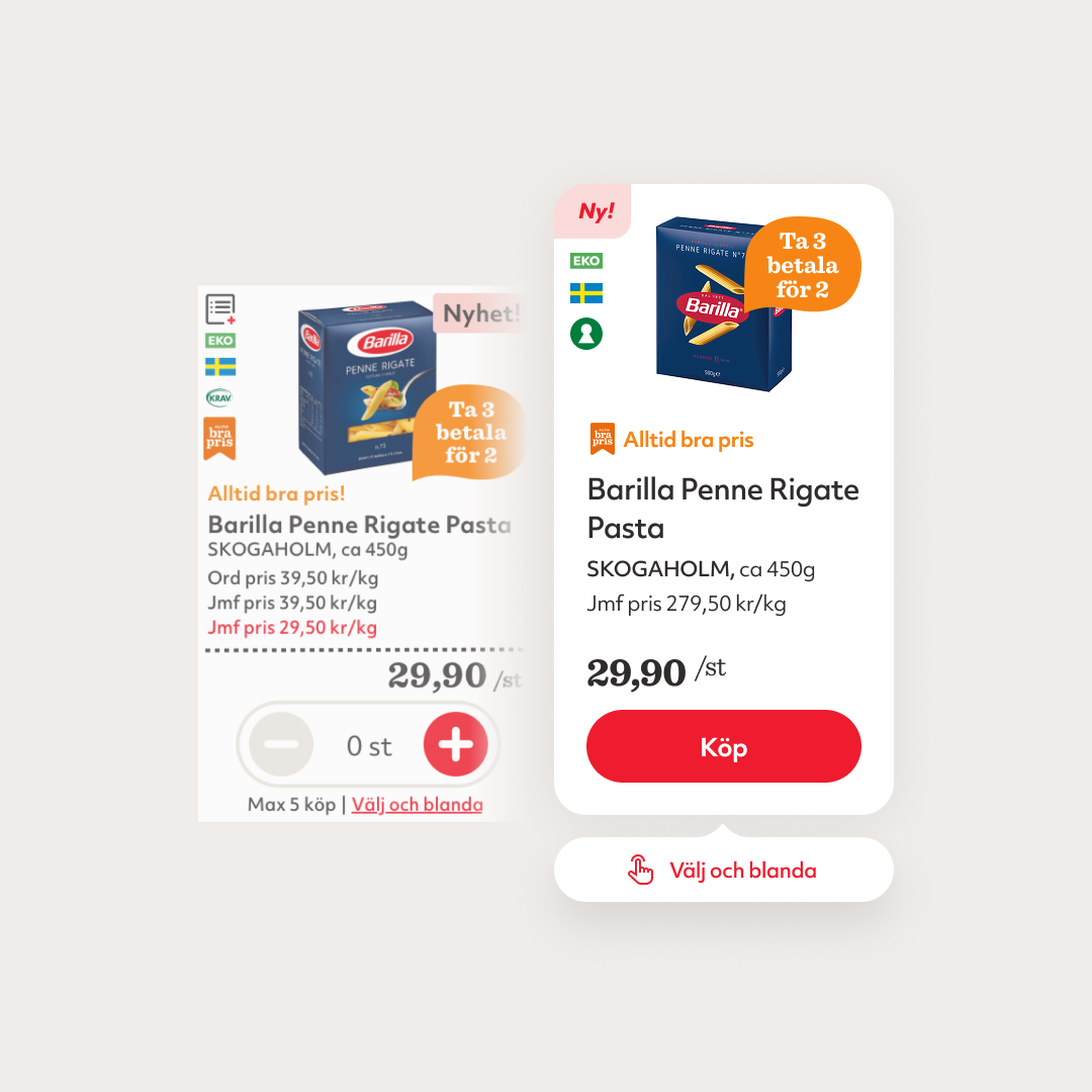
Grocery cards contain unusually dense and inconsistent information
Constraint
Product imagery came from an external source and varied in size & whitespace
Decision
Only show what’s needed to make a purchase in the app
Component impact
Developed one product-card family for three contexts
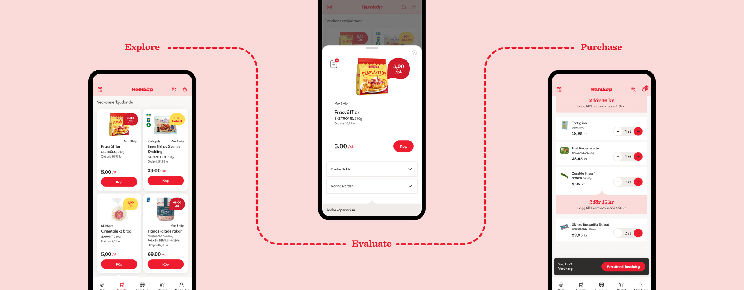
Shopping behaviour designed for mobile
Customers can explore products, open more information when needed without cutting the exploration off, and then move through the basket and checkout.
From basked to checkout
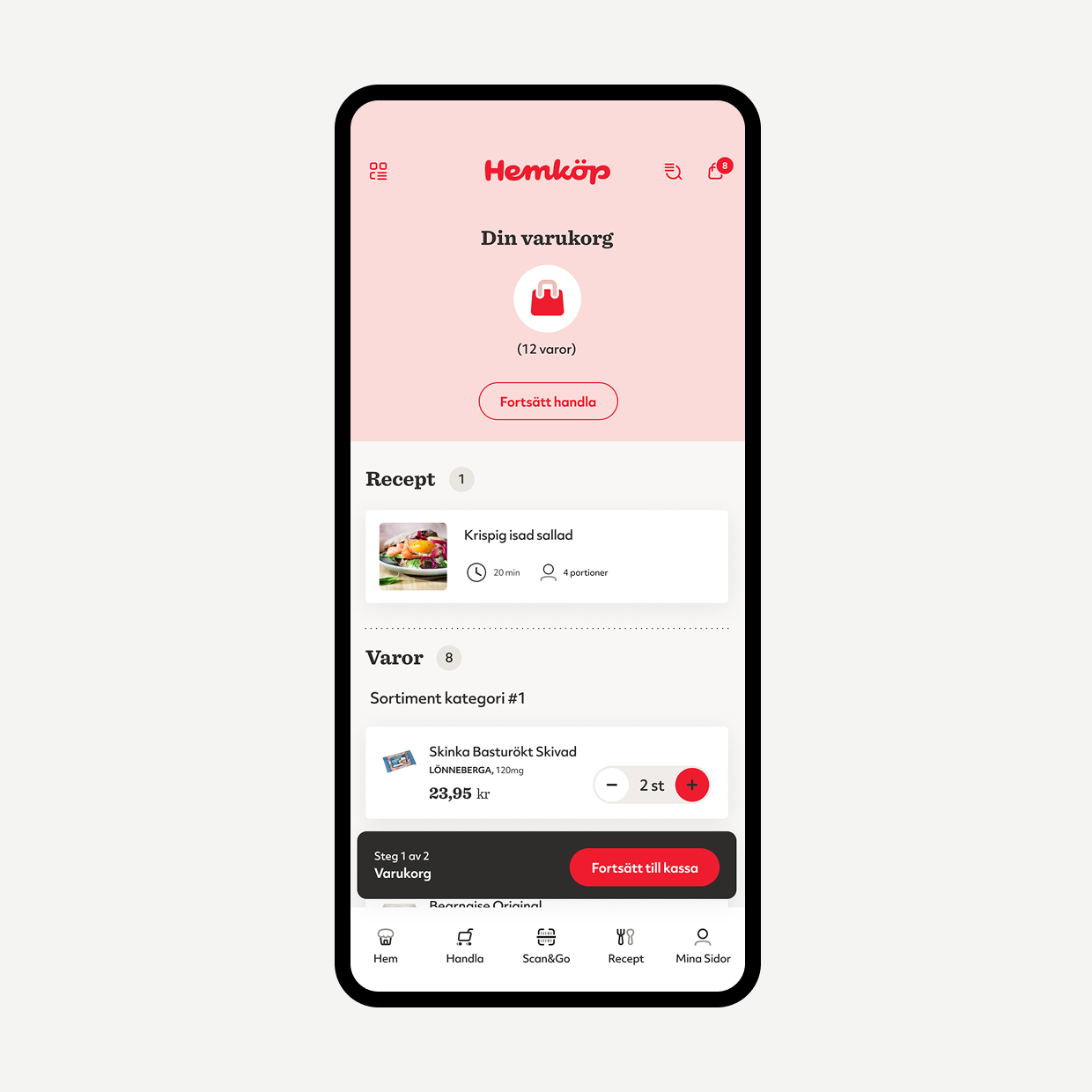
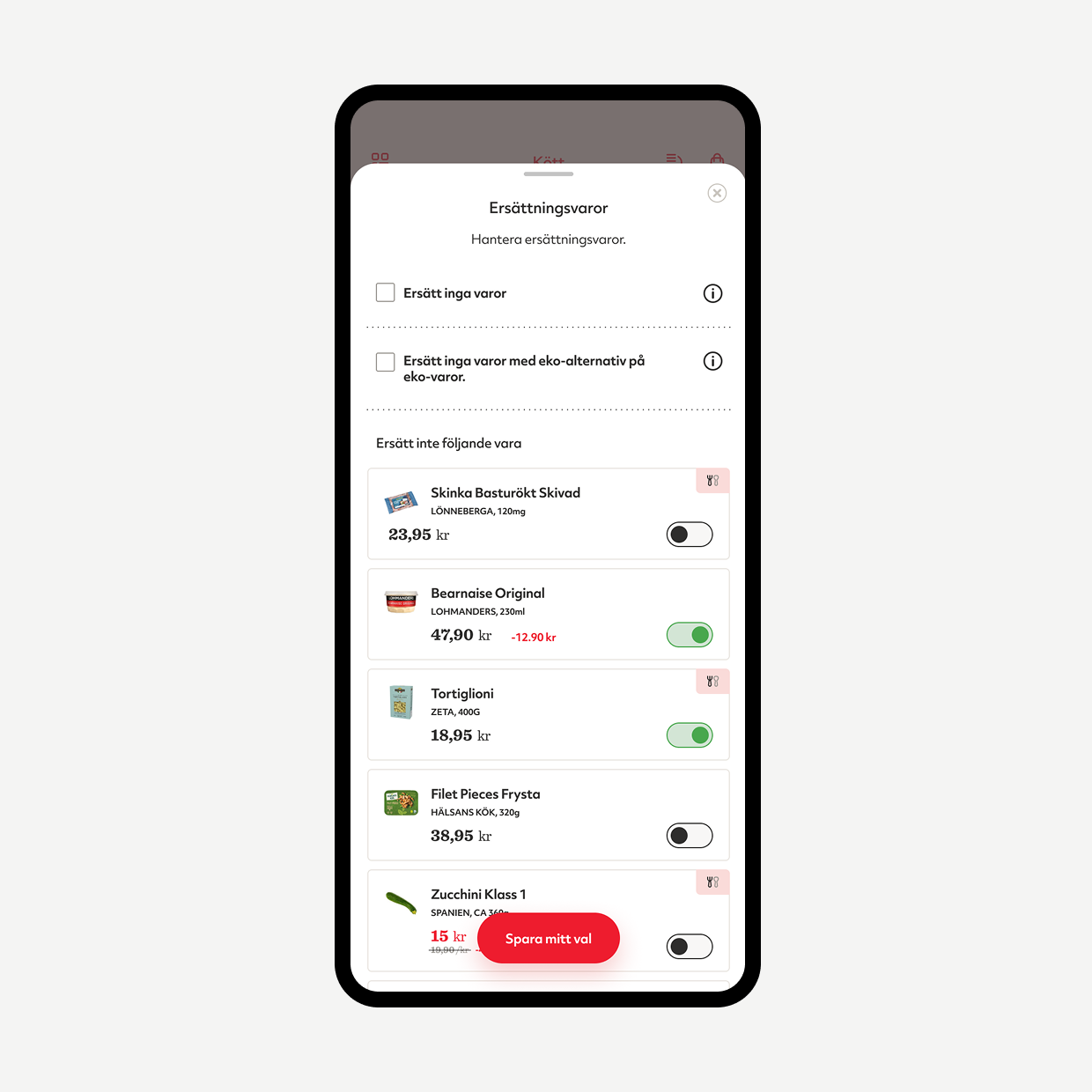
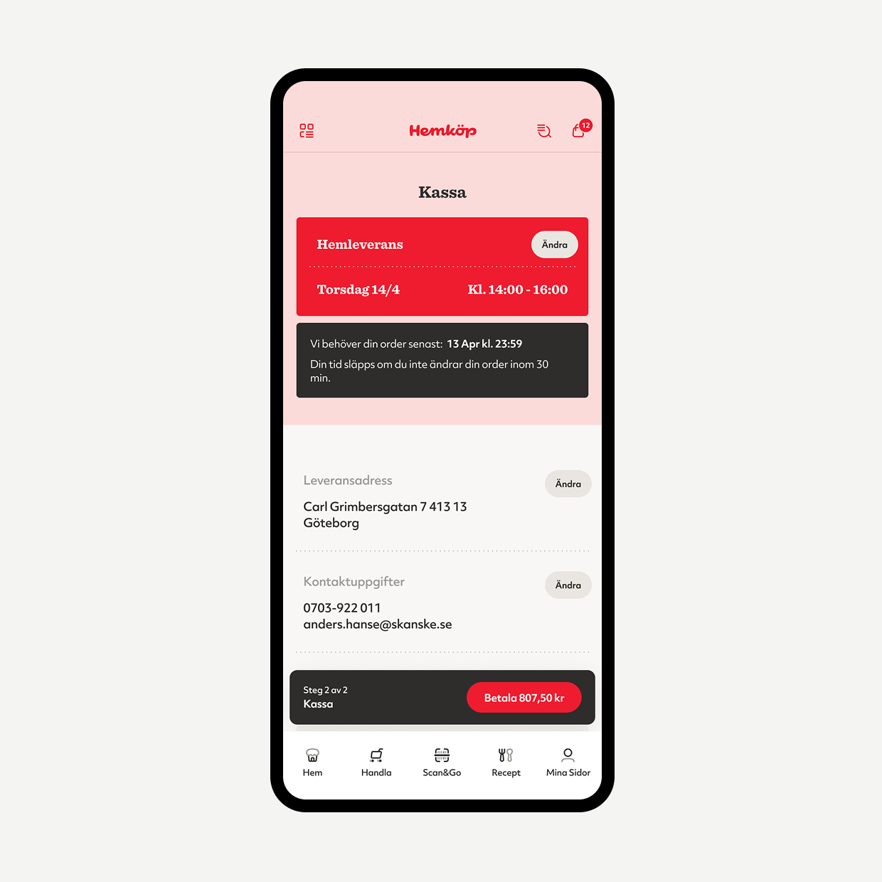
Grocery orders involve more than reviewing quantities. Customers may need to complete offers, manage substitusions and combine recipe items with individual products before paying. These decisions had to remain visible and editable without making checkout feel complicated.
Review
Resolve
Checkout
Making membership value visible
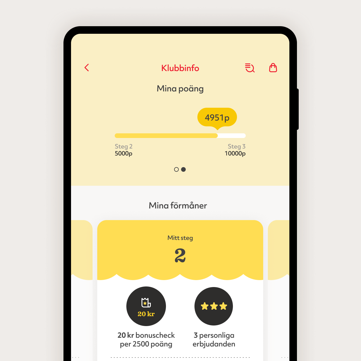
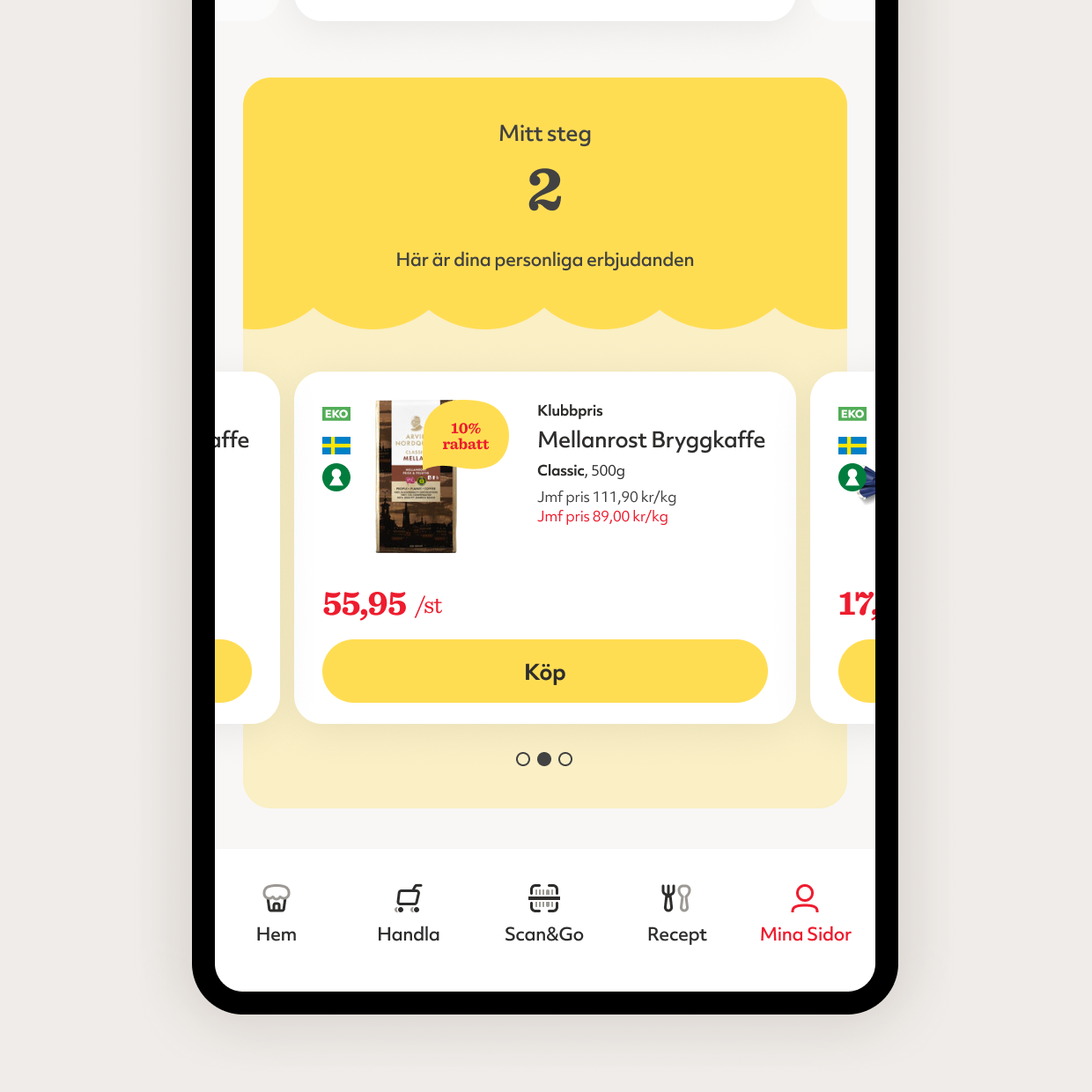
Points, bonus progress, member benefits and personal shopping information were difficult to understand as one coherent membership experience. “Mina sidor” needed to support personalisation and member offers without becoming another promotional feed.
See my value
Voucher, current points, membership level and progress
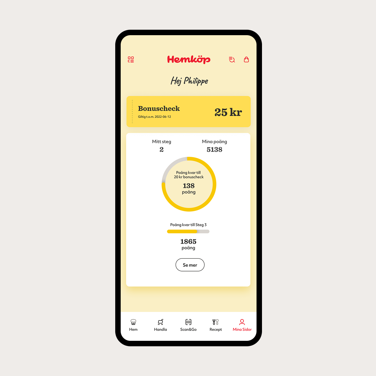
Understand my benefits
What the level includes and how points convert to rewards
Use personal offers
Offers connected to the member
Extending the existing component library for future growth
Hemköp’s existing component library was limited in scope. I extended it with the components, variants and states required by the redesign, while establishing a scalable foundation the team could continue to build on.