Fass - turning a fragmented redesign into one source of truth
Fass was rebuilding one of Sweden’s most important pharmaceutical information service, but the design lacked a clear system. Components, states and responsive behaviour were inconsistent. I was brought in to to turn it into a scalable, implementation-ready design system.
Reported result:
One shared system for Patient, Healthcare and Veterinary. Comparable design tasks became roughly 50% faster, while developer questions and handoff friction decreased.
Client
FASS
Platform
Responsive webb. Fass.se
Year
2024-2025 · Part time
Status
Released
Role
Senior Product Designer - Design Systems
Responsibilities
Design system · UI · Accessibility · Documentation · Developer handoff
Team
LH+P · FASS · Netcompany
The redesign was already underway, but development had no reliable source of truth. Components were duplicated, states were inconsistent and responsive behaviour was unclear. With three FASS environments to maintain, every inconsistency risked multiplying. My job was to turn the design into a system developers build upon.
What is the source of truth?
Which component, state and behaviour should the development actually build?
How do we avoid designing everything three times?
How can Patient, Healthcare and Veterinary share one architecture without losing their identities?
How do we make accessibility systematic?
How can states, colours and behaviours meet accessibility requirements wherever a component is reused?
How do we remove guesswork from development?
What needs to be documented so developers can implement without repeatedly returning to design?
Build the rules before the components
Define the rules
I started by defining the shared rules behind the interface: Color, typography, spacing, icons shadows and grid before rebuilding individual components.
Why this order?
Decisions were made once and inherited everywhere. A color change, accessibility adjustment, or brand switch no longer had to be fixed screen by screen.
What this enabled
With the rules in place, I could rebuild the component library without adding new exceptions.
Developers got a predictable system to build from.
Example
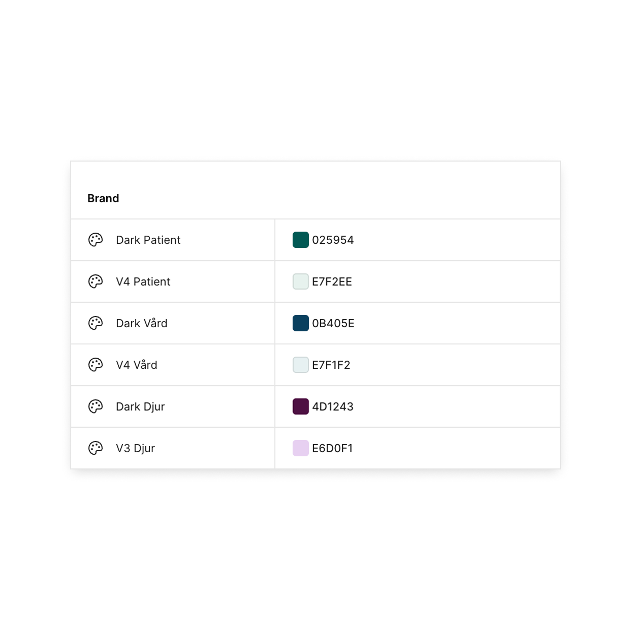
Primitive - raw value
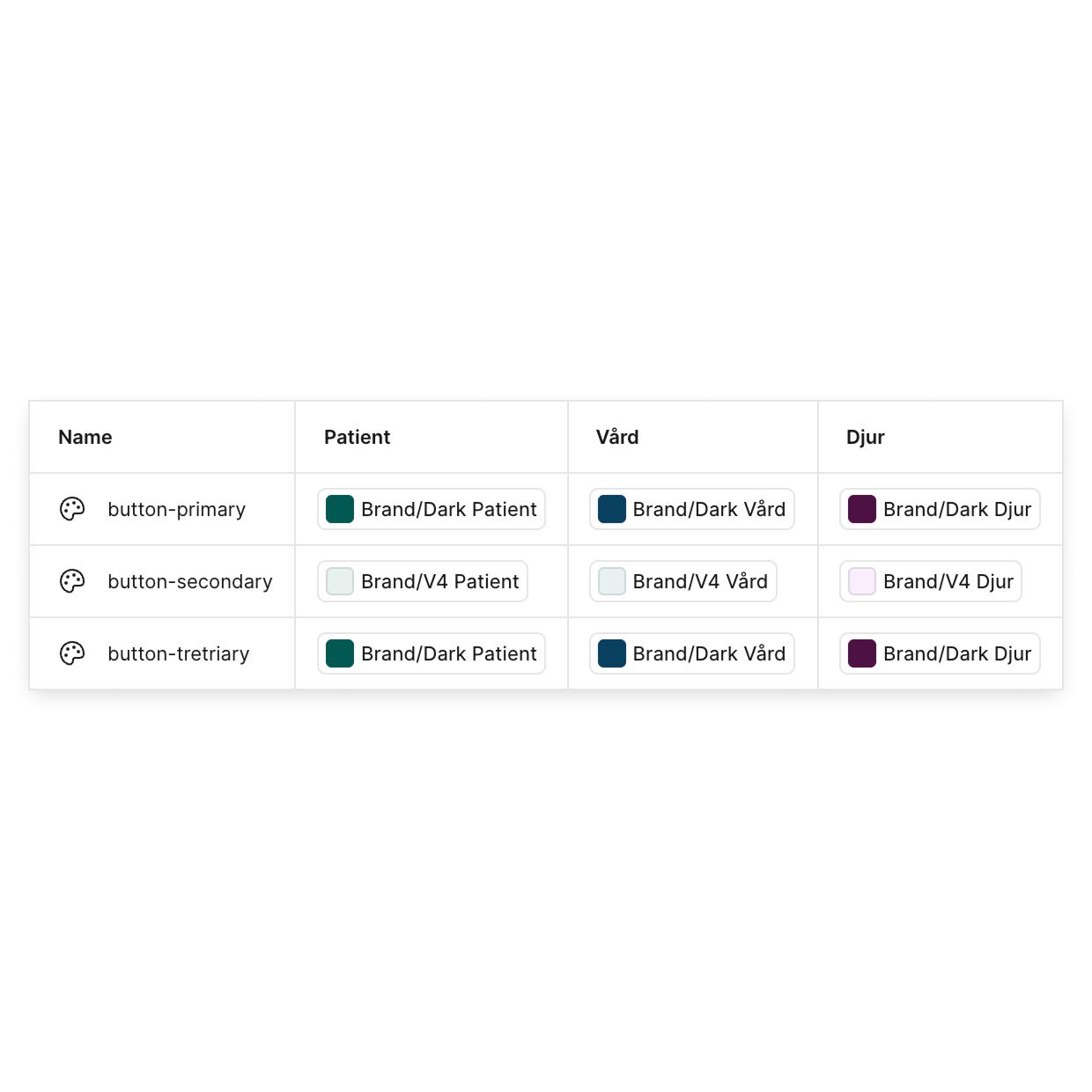
Semantic token - their purpose
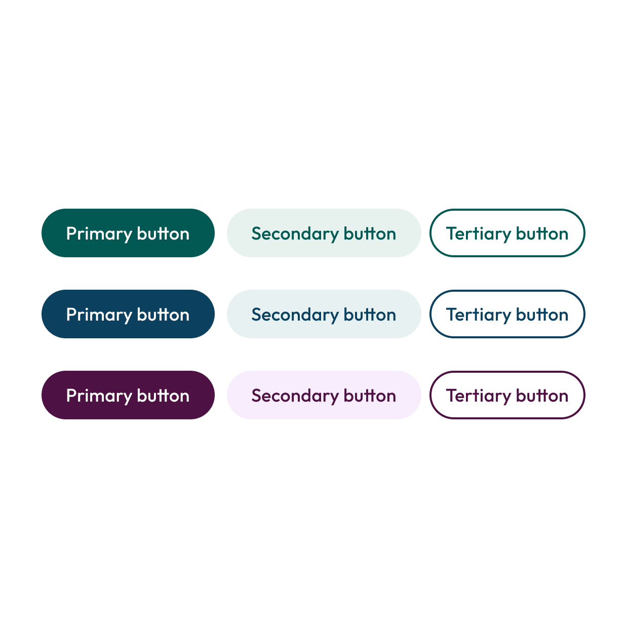
Components - the result
One system. Three modes
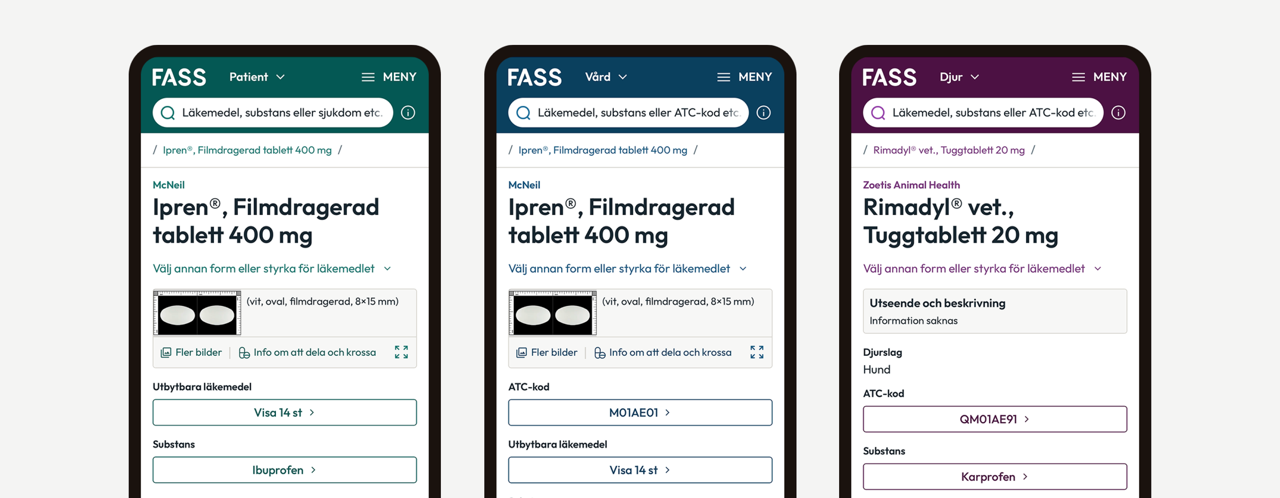
Patient, Healtcare and Veterinary shared the same component architecture. Figma modes mapped the semantic tokens to each identity, so the same screen could switch context without duplicating the design.
Removing interpretation from handoff
The goal was simple: Developers shouldn’t need to guess what the design meant. Every component had its own documentation area containing:
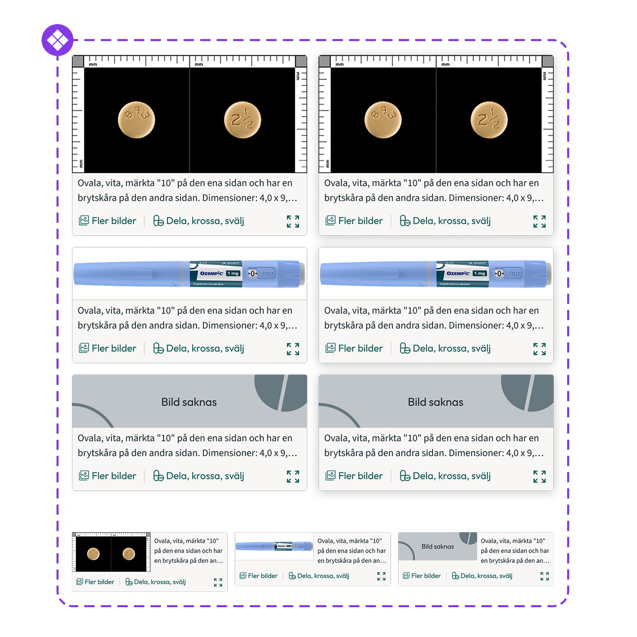
Component
Variants and states.
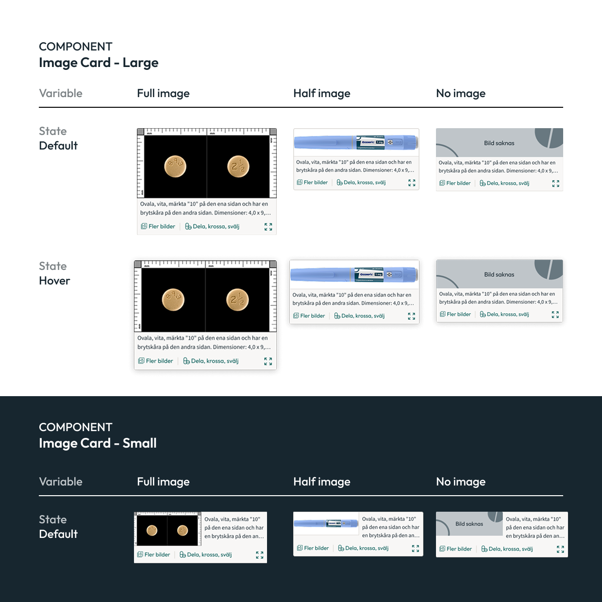
Rules
Documentation of variables and states.
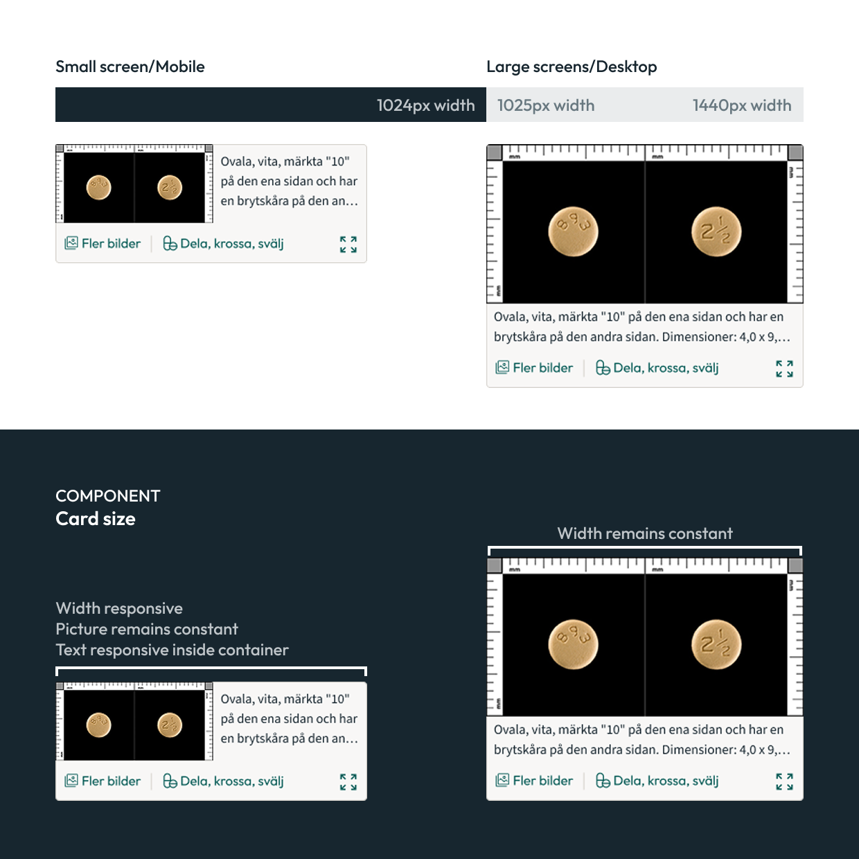
Responsive behaviour
How the component changed across screen sizes.
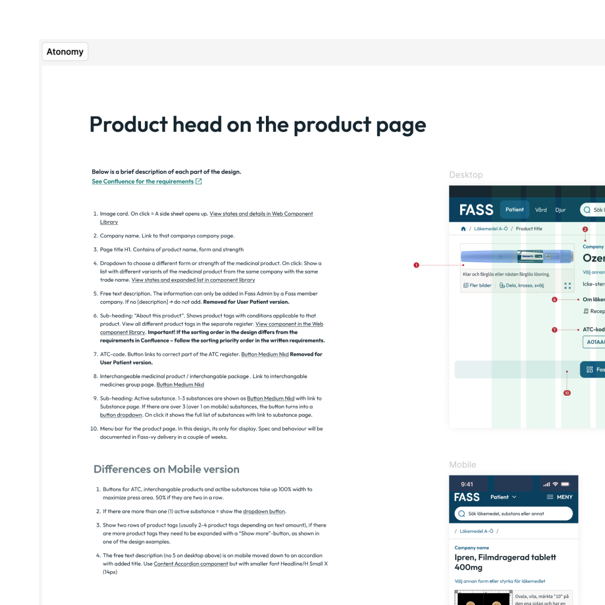
Purpose
Where and how it should be used.
Example
1.Component
2.Rules
3.Responsive behaviour
4.Purpose
Accessibility built in. Usability independently validated
With new EU accessibility requirements arriving in 2025, accessibility had to be part of the system from the start. I checked components against WCAG 2.2 AA while designing them, so decisions around color, states and interaction behaviour were inherited wherever the components were used.
The usability goal was met
RISE independently evaluated the near-final product with 20 participants across Patient on mobile and Healtcare on desktop. No use-related risks emerged during the evaluation, and RISE concluded that FASS gave both audiences clear access to essential medicine infromation
89.2 sus* score
Rated excellent on desktop.
79.3 sus* score
Rated good on mobile
*The System Usability Scale (SUS) is a standard 10 question questionnaire used to measure how easy a system feels to use. It produces a score from 0-100. Not a percentage. With 68 commonly used as the average benchmark.